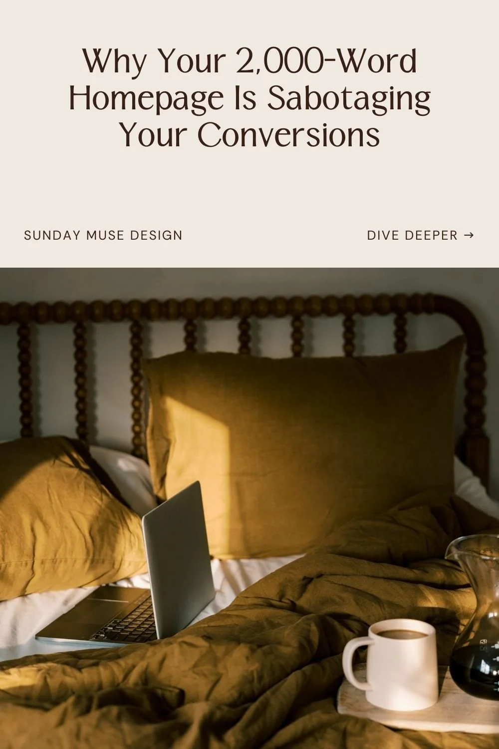
The Case for Saying Less on Your Website (And Why Your 2,000-Word Homepage Is Sabotaging You)
If you need a second cup of coffee just to get through your own website copy... it's probably too long.
And I say this with love, because I've been there. I've written 1,500-word About pages that nobody read past the third paragraph. I've created service pages so dense with information that my own mother asked me what I actually do for a living. I've done the thing where you think more words = more credibility, and then you wonder why people are bouncing after 12 seconds.
Here's what I've learned the hard way: most websites are drowning in information but nobody can actually figure out what you do or why it matters.
People try to say everything. They over-explain, over-compensate, and over-stuff their pages until their message gets buried under bullet points, bolded buzzwords, and paragraphs that could've been emails. (Or honestly, could've been a single sentence.)
And the kicker? Saying more doesn't make you sound smarter or more credible. It makes your reader work harder. And when you make people work to understand what you do? They leave.
So let's talk about why saying less is the most strategic thing you can do for your website.
Simplicity = Confidence (and confidence converts)
When you can say something in fewer words—and say it clearly—it signals confidence.
Think about the last time you landed on a website and immediately got it. You knew what they did, who it was for, and whether you wanted to keep reading—all within about 10 seconds. That’s strategic simplicity at work.
Now think about the last time you landed on a website and had to work to figure out what was even being offered. You're scrolling, squinting at paragraphs, clicking around trying to decode whether this person does branding or coaching or... both? Maybe web design? And honestly you're not even sure anymore so you just... close the tab.
That's the difference between a website that says less and one that says everything.
The best websites lead with their value right up front. They trust that a clear statement and intentional design do more work than three scrolls worth of explanation.
Why "Say everything" doesn't always work
Let me tell you what happens when you try to say everything on your website:
You create decision fatigue. Every extra sentence is another decision your reader has to make: "Do I need to read this? Does this apply to me? Should I keep scrolling or just... leave?" The more you say, the harder their brain has to work. And tired brains don't convert—they bounce.
You bury your main point. If everything is important, nothing is. When you try to highlight all your services, all your credentials, all the ways you're different... your actual differentiator gets lost in the noise. It's like trying to find your keys in a junk drawer. Sure, they're in there somewhere, but who has the patience?
You accidentally create doubt. This one's sneaky. Over-explaining can feel like over-proving. And that energy makes people wonder if you're trying to convince them or yourself. When you say less—when you state your value clearly and move on—you signal: "I know what I'm doing. I know how to help. Here's what matters."
I learned this the hard way when I rewrote my own homepage. I had paragraphs explaining my process, my philosophy, my background, why brand strategy matters, what makes good design, blah blah blah. And you know what happened? People told me they still weren't sure what I actually offered.
So I cut it. Hard. I went from 1,200 words to about 700. I focused on the outcome, not the explanation. And suddenly my inquiries got better. More aligned. Less "do you do logos?" and more "I need exactly what you're describing."
What "Saying Less" actually looks like (with real examples)
This is about designing with intention. Here's how that shows up on a strategic website:
1. Headlines that do the heavy lifting
Wedding Florist example
Before: "I Create Stunning, One-of-a-Kind Floral Designs That Bring Your Wedding Vision to Life and Make Your Special Day Unforgettable Through Personalized Arrangements That Reflect Your Unique Love Story"
After: "Wedding florals for couples who want romance, not filler flowers"
See the difference? The second one is specific, clear, and doesn't make me need a nap.
2. Service descriptions that focus on the outcome
Interior Designer Example
Before: "In this 8-week design process, we'll start with an in-depth consultation where we'll discuss your style preferences, functional needs, budget parameters, and timeline. Then I'll create mood boards, space plans, and 3D renderings. We'll review finish selections together, and I'll coordinate with contractors and vendors throughout installation. You'll receive a comprehensive design package with source lists, paint colors, furniture specifications, and styling recommendations."
After: "An 8-week process that transforms your space from 'I guess this works' to 'I actually love being home.' You'll get a complete design plan and someone managing all the details so you don't have to."
The first one lists the process. The second one sells the outcome. When someone lands on your service page, they want to know what problem you're solving and what their life looks like after working with you—the step-by-step can come later.
3. About pages that connect, not résumé-dump
Personal Stylist Example
Before: [Insert 900-word essay about fashion school, first retail job, styling philosophy, and why clothing matters]
After: “I help women who hate shopping figure out what actually works for their body, their life, and their budget. Former retail buyer, current closet therapist, forever believer that the right outfit changes how you show up.”
Nobody cares that you graduated magna cum laude in 2012 unless it's directly relevant to why they should trust you now. They care that you understand their problem and can help solve it.
4. Microcopy that earns its space
This is the stuff people skip over—button text, form instructions, image captions, testimonials. But when it's done well, it guides people through your site like a friendly tour guide.
Boutique Hotel Example
Boring button: "Book now"
Better button: "Grab Your Dates"
Coffee Shop Example
Generic form text: "Sign up for our mailing list"
Human form text: "Get first dibs on new roasts (and the occasional free coffee)"
See? Same function, but one feels like a robot and the other feels like a conversation.
5. White space that lets your message breathe
Word count matters, and so does visual breathing room. When every inch of your homepage is covered in text, images, buttons, and CTAs, your visitor's brain short-circuits. White space (or negative space, if you want to sound fancy) gives your content room to land.
Bakery Example
Before: Text crammed everywhere—menu items stacked with no breathing room, testimonials fighting for space with photos, call-to-action buttons in every corner screaming for attention.
After: One beautiful hero image of a croissant. A simple headline: "Made from scratch. Worth the drive." Room to scroll. Each section gets its moment.
When you say less, people truly hear you
Your website copy’s job is to say the right thing clearly enough that people know what to do next. And it needs to do this by showing your confidence and making it obvious how you help—without forcing people to decode paragraphs and bullet points to figure it out.
When your message is clear and focused, it pulls the right people in. It makes their next step feel obvious. And it separates you from the sea of websites that all sound the same because they're trying to say everything at once.
If your website is saying too much and still not converting, the issue is usually focus. You need to cut the noise and get clear on what actually matters. And that's fixable.
If your site feels like a term paper nobody asked for, let's fix it. My Brand Strategy Intensives and VIP Design Intensives are built to cut through the noise and give you a brand and site that says exactly what it needs to—and nothing more.
Still not convinced? Go look at your own website with fresh eyes. (better yet - get your mom to scan it) If you can't skim it in 30 seconds and understand what you do, who it's for, and what to do next... your reader can't either. And that's the problem we're solving here