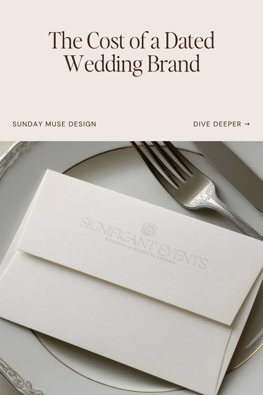
Inside a Luxury Wedding Planner Rebrand: Significant Events by Sunday Muse Design
The first time Haines and I got on a call, she said something I think about a lot: “My brand is whimsical and girly, and I am neither of those things.”
Her website at the time had a flowing script wordmark, a pastel palette in the dove-gray-and-cream family, a lavender CTA button that felt like a bridesmaid dress from 2015, and a homepage headline that said “YOU’RE KIIND OF A BIG DEAL”—typo and all, sitting in full caps on the home page.
In the years since she’d last touched it, she’d built a very successful Southeastern wedding planning business, and her brand was still dressed for an earlier version of the business.
If you’ve ever looked at your own website and felt that specific full-body cringe of this used to feel like me and now I’d rather not send the link—that’s where she was.
We rebuilt the whole thing from scratch: brand strategy, creative direction, visual identity, copy, custom Showit site. Here’s what we did and why.
Where the Old Brand Was Failing Her
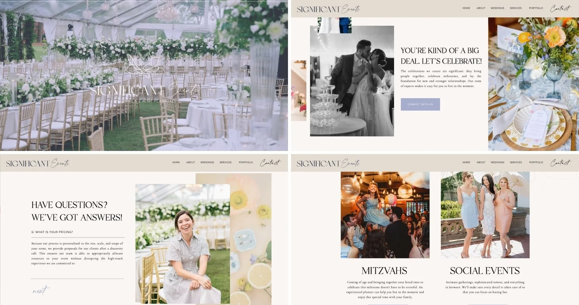
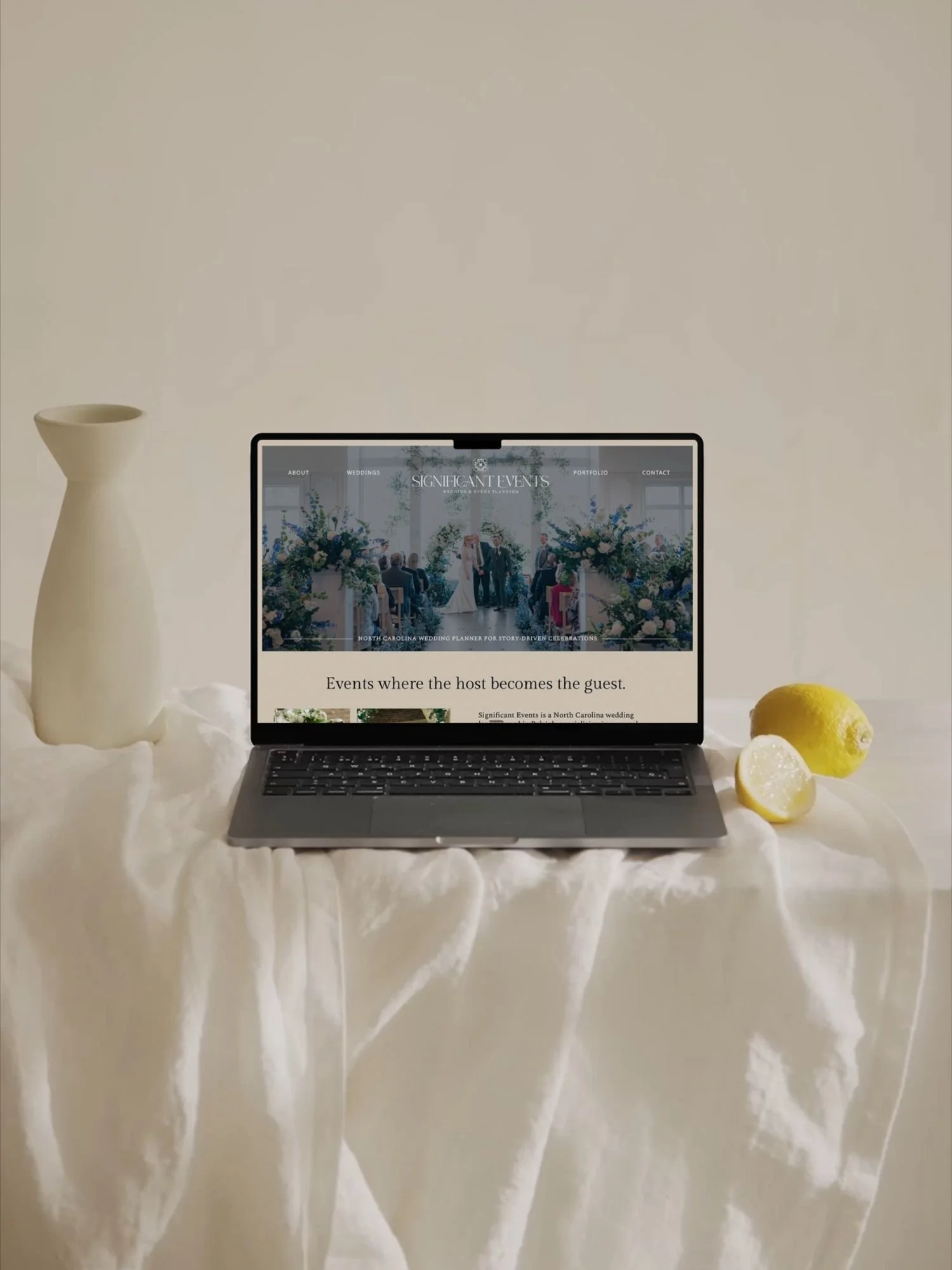
The Website Before
Her business had outgrown her brand by a MILE (or two). Her clients (the ones she REALLY wanted) were busy, taste-driven couples planning weekend-long celebrations across Highlands, Cashiers, Asheville, and Charleston. These people are founders, partners, physicians…people who’ve made it through their thirties with opinions and a travel rewards card.
They weren’t the people her website was talking to.
Womp womp.
The old brand had a handful of specific problems that kept compounding:
The wordmark was working against her. A flowing script Events paired with a serif SIGNIFICANT… the whole thing sitting in that wedding-industry house style you’ve seen a hundred times. Yeah, sure - it’s pretty in isolation. But it’s also interchangeable with every other planner in a ten-state radius.
The hero was gorgeous and generic all at once. A beautiful tented reception shot with florals and chiavari chairs—which is fine, except it could’ve been on any planner’s homepage. The subhead paired “Wedding & Event Planning” in a way that muddled the positioning, and the CTA section (“YOU’RE KIIND OF A BIG DEAL, LET’S CELEBRATE!”) had a typo sitting on the homepage in full caps. (Luxury doesn’t survive typos. Neither do high-investment planning fees.)
The navigation gave equal weight to three different businesses. Weddings, Mitzvahs, Social Events. One nav, three offers, three photography directions that didn’t speak to each other. The mitzvah photo showed a kid in a sequined dress under string lights. The social events photo showed three women in pastel cocktail dresses with parasols. Both beautiful. Neither of them related to a destination wedding weekend in the mountains. A couple landing on that homepage had no way of knowing what this business was for.
The color palette was dusty pastel. Dove gray, soft cream, a lavender accent that felt dated the second you looked at it. I mean… it’s pretty… but it also felt disconnected from the Southeast destination-weekend market she was working in—a market that skews toward deep woods, heritage interiors, and couples who own real wine glasses.
The copy did none of the heavy lifting. “The celebrations we curate are significant: they bring people together, celebrate milestones, and lay the foundation for new and stronger relationships.” It’s an “ok” sentence but it said nothing about who she is, what makes her different, or why a discerning couple should book her over the six other planners whose sites look exactly like hers did.
And the FAQ handled pricing the way every planner handles pricing. “Because our process is personalized… we provide proposals for our clients after a discovery call.” This is a perfectly reasonable business decision.. But it also meant every inquiry started cold, with no pre-filter, no budget self-selection, and no clue whether the couple on the other end was bringing $40K or $400K to the table.
The Strategy: Catching the Brand Up to the Business
We started with Sunday Strategy because a visual refresh without positioning is the fastest way to spend a lot of money on a prettier version of the same problem.
What became clear through strategy work was that Haines wasn’t just planning weddings—she was designing wedding weekends. She was planning the Thursday welcome drinks through the Sunday farewell brunch, the pacing, the guest flow, the vendor team, all of it choreographed so the couple could show up to their own wedding as guests instead of producers.
We built the whole brand around a concept we started calling Considered Hospitality: the idea that the weekend should feel personal and unhurried, decisions should be light and approvals should be clear, the money conversation should happen in plain English on day one, and guests should feel like VIPs from welcome drink to farewell biscuit.
Her new positioning statement:
Wedding-weekend planning for busy, taste-driven couples in the Southeast. We turn your point of view into a cultivated, experiential weekend and we engineer it to run beautifully.
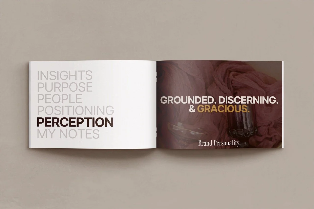
The persona we landed on for her brand voice (The Weekend Editor) is grounded, discerning, gracious. Someone who edits choices, sets the pace, runs the team. Not a fairy godmother. Not a best friend. An editor. Taste-led. Calm. A little dry when a moment needs lightness.
(I mean who doesn’t want this kind of person planning their wedding?!)
That voice became the backbone for every word on the new site.
The Visual Identity: From Script Wordmark to Weekend Editor
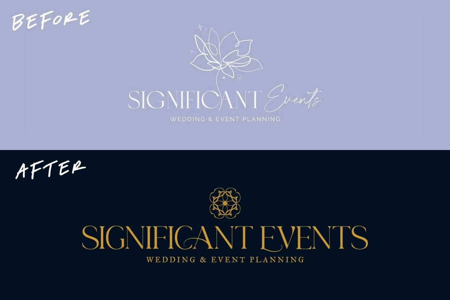
Before and After of Wedding Planner logos
The visual direction had one job: signal the actual scale of the work. Destination wedding weekends need a brand that looks like it belongs in the same room as the venues her couples are booking.
Here’s what changed:
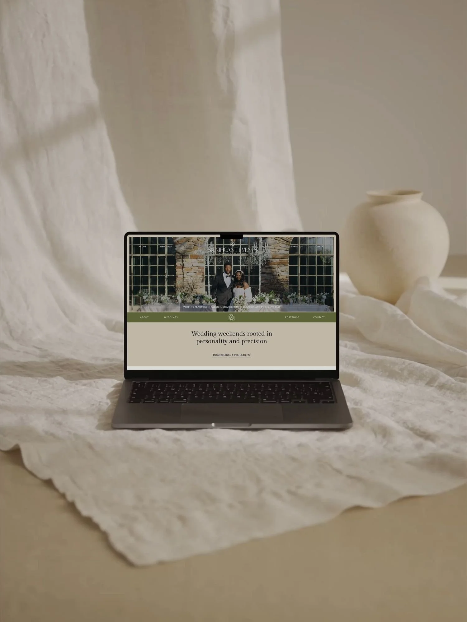
Typography. We killed the script and rebuilt the system around one display face for headlines and a clean sans-serif for body. It reads like a brand that trusts its own typography to do the work, which is what you want when your clients are comparing you to the planner their friend used at Blackberry Farm.
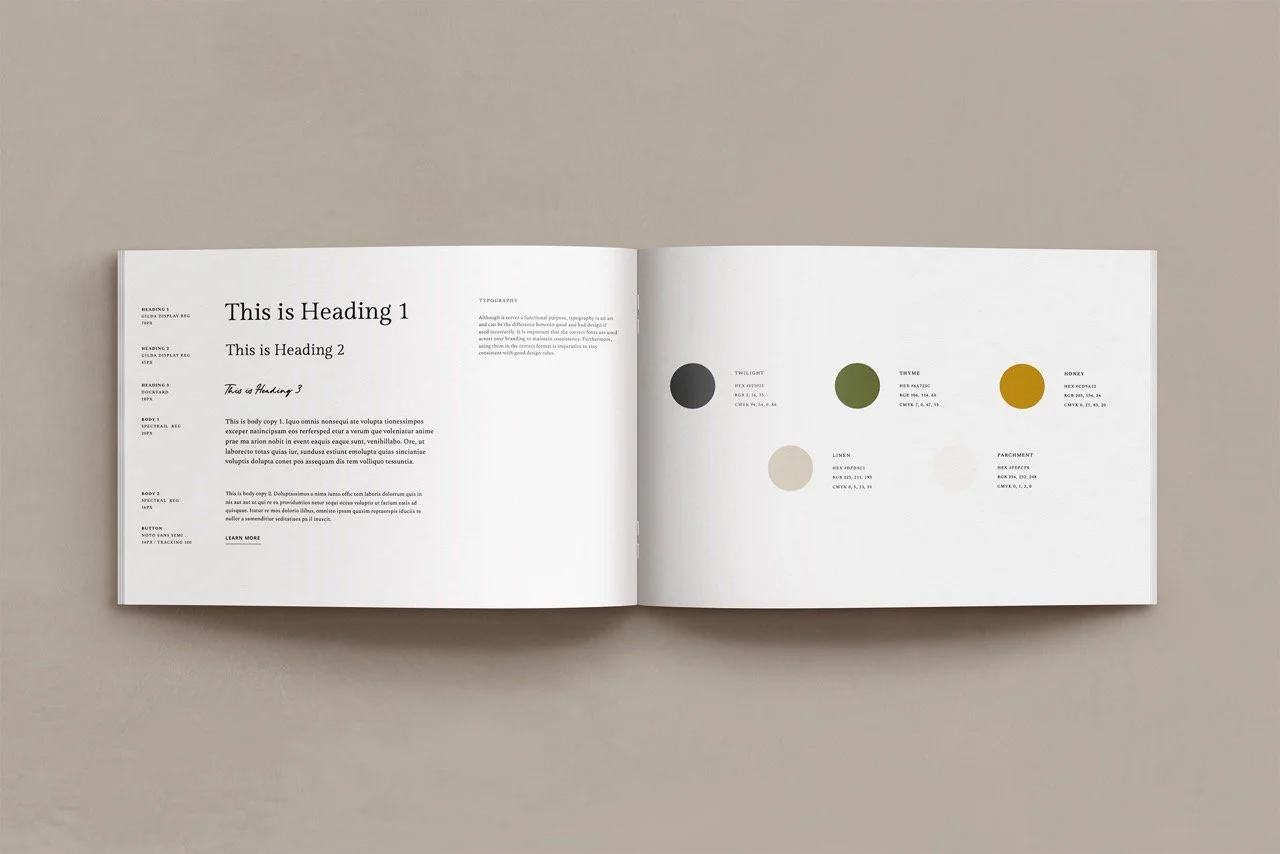
Color. The new palette is a grown-up Southern story with a deep espresso brown, warm cream, a gold accent that reads as heritage rather than metallic, with supporting earth tones that can stretch from a Highlands stone terrace to a Charleston courtyard without feeling out of place.
Photography direction. We moved away from the soft, bright, over-composed imagery the old brand leaned on and toward moody, editorial-leaning work showing guests caught mid-laugh, tablescapes at the golden hour moment right before dinner starts, ane the back of a bride’s dress on a stone staircase. Less Pinterest board, more Cabana magazine.
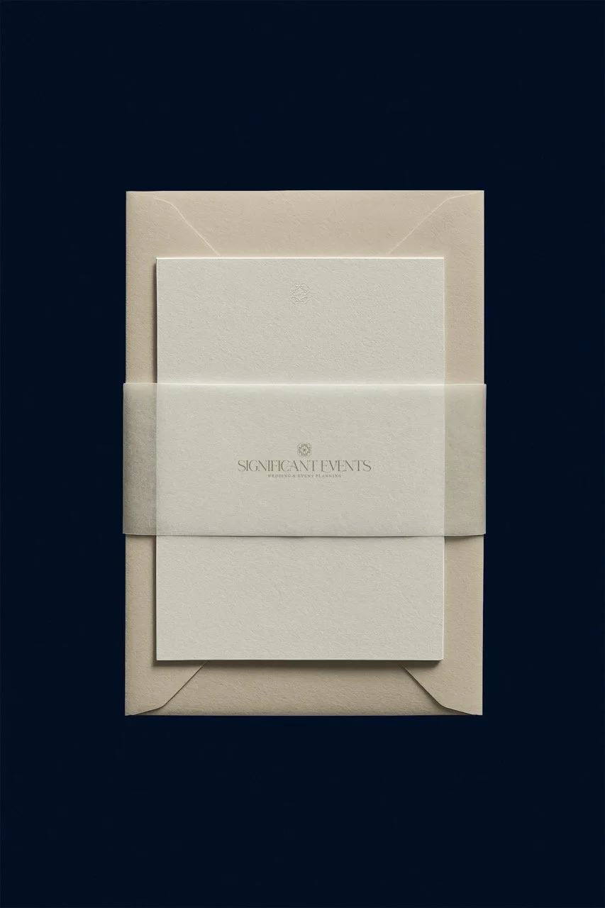
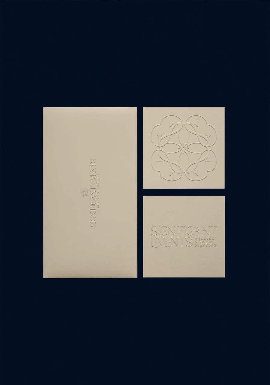
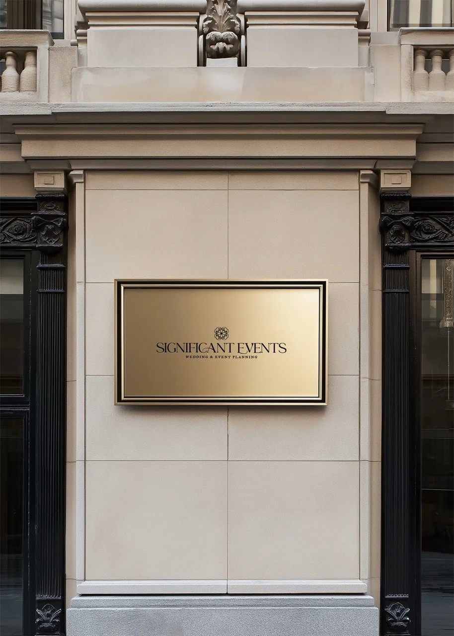
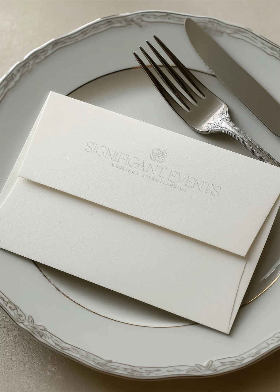
Logo. The old wordmark had a thin, curly elegance that dated it instantly. The new primary mark is a confident display wordmark with better proportion, paired with a small set of secondary marks and monograms that give her flexibility across print (welcome boxes, menus, signage) without needing to reinvent the wheel every weekend.
Overall feel. The old brand said Etsy wedding shop. The new brand says the planner your friend hired, and you spent the whole weekend trying to figure out how she made it look that effortless. If you put her site next to a Charleston Magazine feature, they'd speak the same language.
The Copy: Writing Against the Persona
With The Weekend Editor as the voice, every line on the site got rewritten with intention. Out went magical, perfect, fairytale, celebrate, let’s party. In came language that matches how her clients talk.. The ones who say hospitality unironically, who know what a run of show is, who want to know what the approval process looks like before they sign anything.
The homepage leads with the weekend framing instead of the split weddings-plus-events positioning. The Services page names the scope of full-weekend planning instead of leaving inquiries to guess. The FAQ answers questions people ask (budget expectations, process, timeline) instead of performing mystery.
Every CTA on the site is written in her voice—Start with the weekend. See if we fit. Preview the plan.—which does two things at once:
It filters.
And it sounds like her on a discovery call, which means the couples who book are already primed for who they’re about to meet.
The Website: A Custom Showit Site Built to Filter
We built the new site, fully customized, on Showit. Here are a few decisions shaped how it came together:
The navigation got reorganized around weddings. Weddings are the star. Mitzvahs and social events still exist but live in a subpage hierarchy instead of competing for top-nav real estate. That single change does more strategic work than most full rebrands do, and it tells every visitor what the business is for within three seconds of landing on the homepage.
Budget guidance lives on the Services page. We added clear per-guest investment bands so couples can self-select before they fill out the inquiry form. Coordinator-level inquiries slow down. Right-fit inquiries speed up. Inbox gets calmer.
The portfolio became a single gallery of her best work. We pulled the strongest imagery from her past weekends into one cohesive scroll—the kind of gallery that does the talking for her while she's on a flight or in a tasting or ignoring her phone on a Saturday. It's designed to be screenshotted and sent.
The inquiry form got rewritten. Fewer questions, better questions. The form itself is now part of the filter, asking the things that tell Haines within thirty seconds whether this is a conversation worth having.
What Haines Said About the Process
Her hesitation before booking was the cost. She told me that directly, and I respect it because there's a real difference between price and cost, and most people conflate them.
The price is what you pay today. A full brand and custom Showit site is an investment, and we have payment plans.
The cost is what you pay over time when the brand stays wrong. It's the inquiry that doesn't come in because your site looked dated on the referral text. It's the couple who books the other planner because her website matched the venue and yours didn't. It's the discount you offer without meaning to because you're not sure you can charge what you're worth when your homepage is telling a different story. That cost compounds. It's also the cost most people don't price into the decision, which is why they sit with a brand that isn't working for longer than they should.
Haines did the math the right way around. She paid the price. She stopped paying the cost.
The part she said meant the most to her was the support through tough decisions—which tracks, because this work isn’t mostly design. It’s mostly a lot of here is what your website needs to say, and I know it feels vulnerable to say it that plainly, but it’s the truth and it’ll do the job. I push my clients. Kindly. But I push.
The word she used when I asked her to fill in “Working with Sunday Muse Design helped me feel a lot more____” was confident.
That’s the job.
If You See Yourself in Any of This
Most of the people who land on a case study like this aren’t brand-new business owners looking for a starter kit. They’re founders a few years in, booking good clients, with a website that’s a little embarrassing to send—and a sneaking suspicion that the brand is costing them the couples they want.
That’s the work I do.
If you’ve been sitting with that feeling for longer than you’d like to admit, you know where to find me.