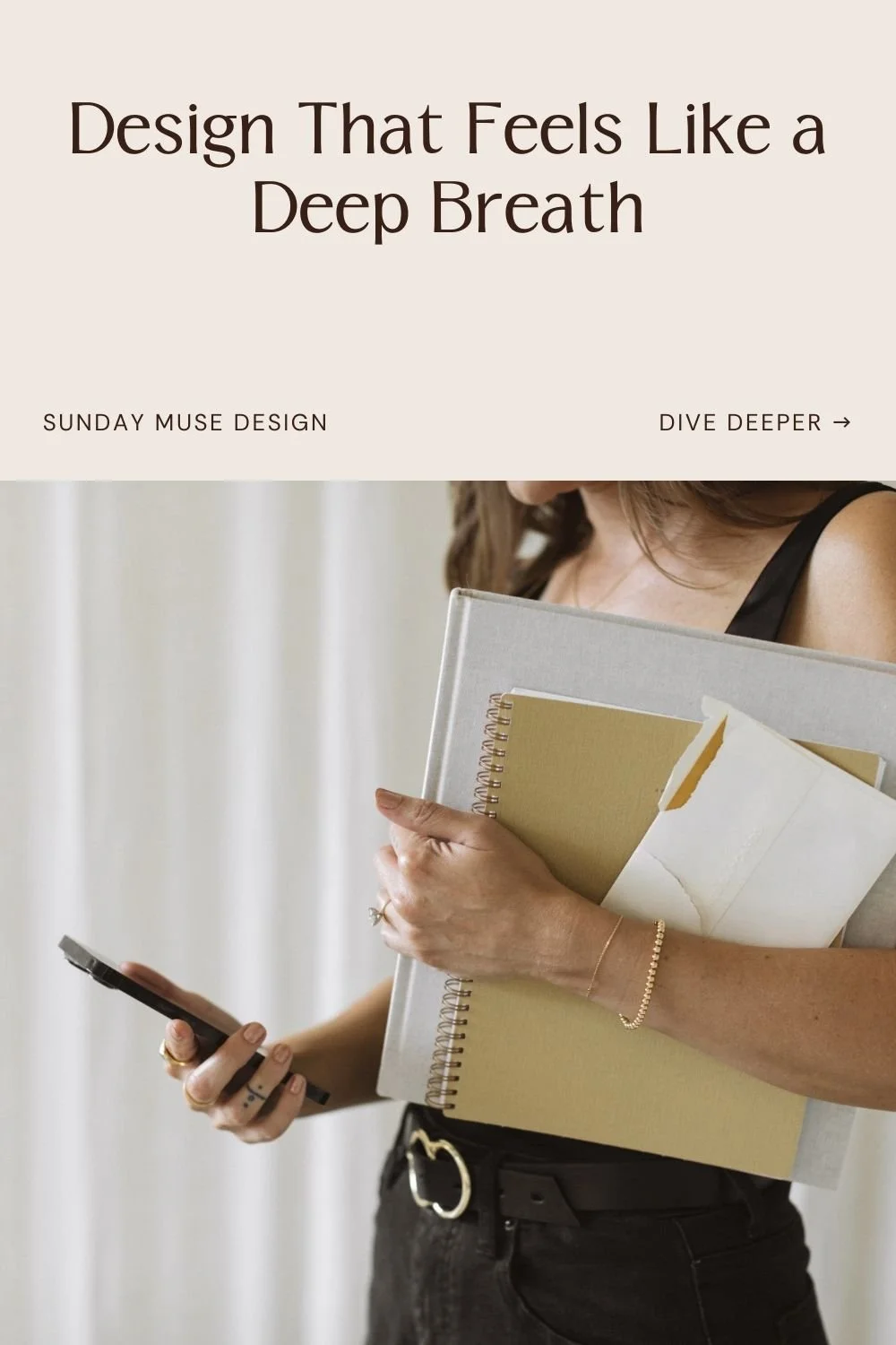
Design That Restores: Why Your Website Should Feel Like a Deep Breath
Last week, while I was wiping peanut butter off a toddler and trying to schedule a client kickoff call at the same time, I opened a website I’d bookmarked months ago. It belonged to a skincare brand I’d forgotten I followed, and immediately, I felt it: that deep inhale. The kind of calm that makes your shoulders drop without even noticing.
And I thought—why don’t more websites feel like that?
We’re so used to speed. Conversion. Noise. Endless tabs and pop-ups and newsletters we don’t remember subscribing to.
The default energy online is often "hurry up," not "settle in."
And somewhere in all that hustle, we forget what a well-designed website can do: create a pause, a moment, and an invitation.
That’s what I’ve been building lately—brands and websites that breathe with you, not at you. Projects that center clarity and strategy, yes, but also softness. Spaciousness. Thoughtful pacing. Like a good conversation with someone who really gets you.
Why design that restores matters
A lot of brands out there are built for attention: scroll-stopping, dopamine-chasing, high-shine hustle. And that’s fine for them.
But if you’re building something intentional…something that prioritizes clarity, trust, and long-term resonance—then you need a brand that knows how to breathe.
Your clients are already overstimulated and navigating plenty. A calm, intuitive website helps them exhale.
What that actually looks like
Here’s what I mean by “restorative” web design (yes, it’s a vibe—but it’s also a very practical framework):
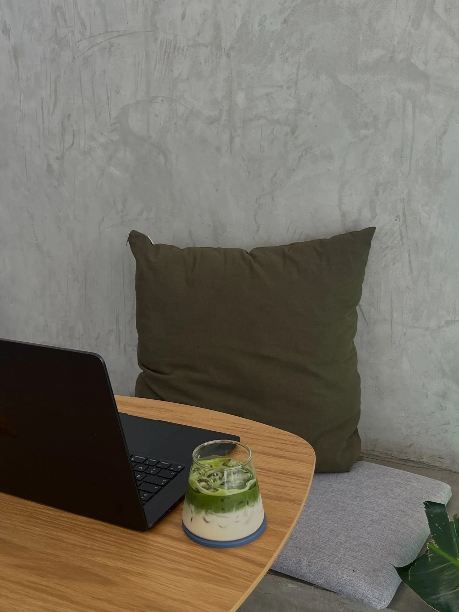
Calm clarity over chaos (Think: the digital version of walking into a beautifully organized boutique instead of a packed department store.)
Layouts that guide instead of overwhelm, with intuitive navigation and purposeful spacing
Messaging that’s easy to scan and absorb—like a site map with manners
Room to breathe between elements, so the eye can rest and the brain can focus
Rhythmic storytelling (Think: a thoughtful dinner party host who knows when to pass the wine and when to let the moment linger.)
Pages built to read like a trusted conversationL gentle, but confident
Scroll-triggered animations and transitions that support the narrative, adding interest without distraction
Anchors throughout that affirm who you are and how you help, clearly and consistently
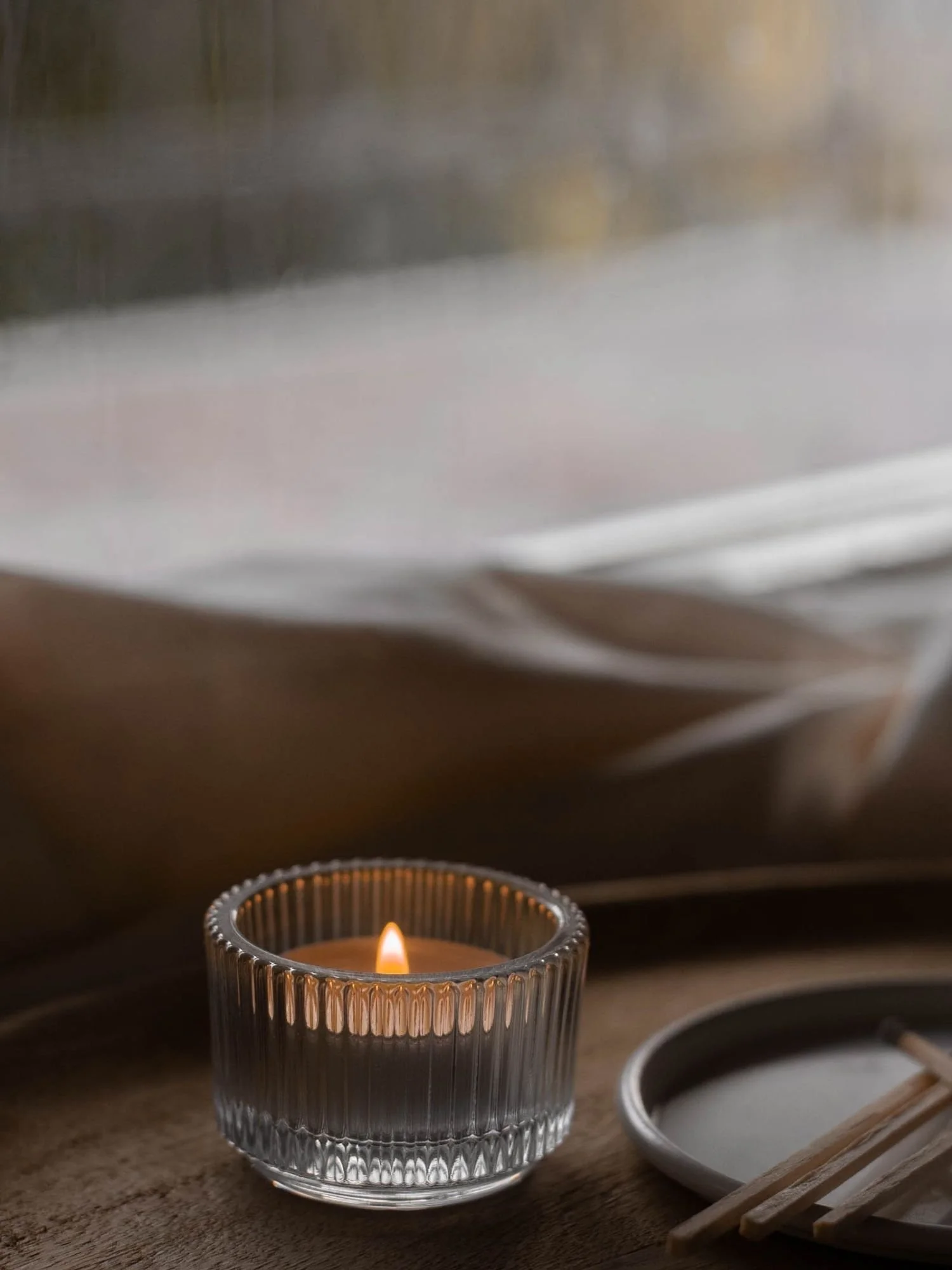
Intentional sensory design (Think: natural light, real smiles, and just the right amount of polish.)
Color palettes chosen for energy and emotion—whether calming, joyful, or rooted in elegance
Typography that’s legible and refined (no squinting, no guessing)
Brand photography that shows you in your element—comfortable, connected, and doing your work
Emotional alignment (Think: messaging that meets them where they are and shows them what’s possible next.)
Copy that captures what your client is already thinking, but hasn’t said out loud yet
Visuals that echo the emotions behind your offer—confidence, comfort, excitement, trust
Invitations to take action that feel like a clear next step, not a sales pitch
How to check if your current website is doing this
Ask yourself:
Can someone land on your site and feel the energy of your brand within 5 seconds?
Is your offer obvious and easy to understand?
Does your website create ease, or does it create decision fatigue?
Do you feel proud sending someone there today?
If not, it might be time to rebuild. You’ve grown. So should the way your brand shows up.
Let’s build something that breathes with you
I design brands and websites for founders who want to feel at home in their business again. Who are done chasing shiny trends and are ready for resonance.
If that’s you, we should talk.