Why Your Website Looks Great But Still Isn’t Booking Clients

Most websites are gorgeous and confused. They load fast, they look good in a screenshot, every page exists where you'd expect it to, and somehow they're still bringing in either crickets or the wrong inquiries. The site has a beautiful color palette that someone's mother complimented unprompted, the launch announcement got 33 fire emojis on Instagram, and yet it sits there, doing the digital equivalent of standing in the corner at a party.
I see this constantly with the women I work with. They're getting traffic, getting follows, sometimes getting inquiries—they're just not the right inquiries, and not at the volume their business has earned.
The website usually gets blamed first because it's the most visible part of the problem, but the website is rarely the only thing that's stalled. Most of the time, the brand itself hasn't caught up to the business. The positioning, the visual identity, the messaging, the way the whole thing communicates what's been built—all of it is running on a version of the business that doesn't exist anymore. The website is just where you see it most clearly, because the website is where strangers go to decide whether to take you seriously.
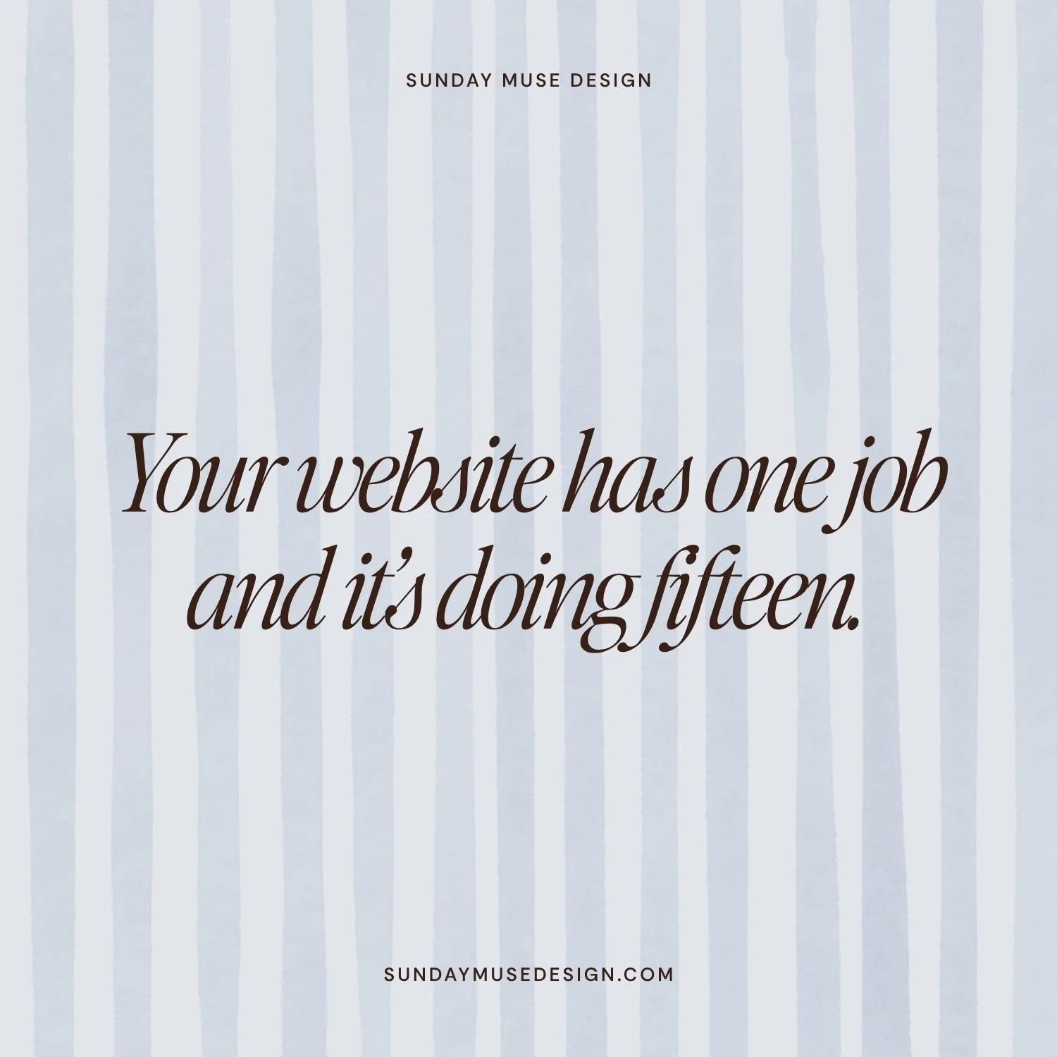
So when I talk about the website having one job, what I'm really talking about is the brand having one job, and the website being the place that job either gets done or doesn't.
I want to walk through what the one job actually is, why so many smart, capable women miss it, and the seven specific places where the one job goes to die on sites that otherwise look genuinely beautiful. This is the part you won't get from a Google search or an AI tool that's been trained on every web design blog post written since 2014. This is what I see every single time I open a client's site for the first time.
The One Job (and Why "Convert Visitors" Is Not It)
Ask ten web designers what a website is for and you'll get ten variations of the same answer: Convert visitors. Build trust. Tell your story. Establish authority. All of those are outcomes that someone, somewhere along the way, started passing off as assignments. They're what happens when the website does its job well, but they're not the job itself.
The real job of a website is this: make the next decision easy for the right person.
That's the whole job. Every other thing your website does is either in service of that, or it's getting in the way.
The "next decision" piece is carrying most of the weight in that sentence, so let me get specific. The next decision is whatever forward motion makes sense for the person at the stage they're in when they land on your site. A cold visitor who found you on Pinterest at 11pm has a different next decision than someone you Voxer'd with last week. The cold visitor's next decision is something low-lift like "save this for later" or "join the email list," and the Voxer person's next decision is "send the inquiry." Both are valid, both belong somewhere on your site, and they shouldn't be living on the same page asking your visitor to choose.
Here's the part I rarely see anyone talk about, though. A website that tries to make every decision easy for every person ends up making no decision easy for anyone. Decision fatigue is a real cognitive load, and it's the silent killer of websites that look fantastic on the outside. Your visitor lands, sees seven calls to action, three different value propositions, two freebies, a service menu, a portfolio, a newsletter opt-in, and a podcast cross-promo. Their brain does what brains do under pressure. It picks the easiest available option, which is to leave.
The one-job framework asks a different question than "what should my website include?" That question gives you a bloated site every time. The right question is: who is this for, where are they in the decision process, and what's the single next step I want to make impossibly easy for them.
That question changes the architecture of the entire site.
How a Website Behaves on a Real Human Being
I want to stop here and say something about how a website works when a real human being (not a bot) uses it, because most web design advice skips this and it's the reason most of the advice is useless. The advice treats your visitor like a logical reader who's sitting down with a cup of coffee to consume your homepage top to bottom and weigh the merits of working with you.
That is not what's happening.
What's happening is this: Someone clicks your link. They land. Their brain takes about five seconds to make a series of fast, mostly-unconscious assessments:
Am I in the right place?
Are these my kind of people?
Is this going to be worth my time?
What am I supposed to do here?
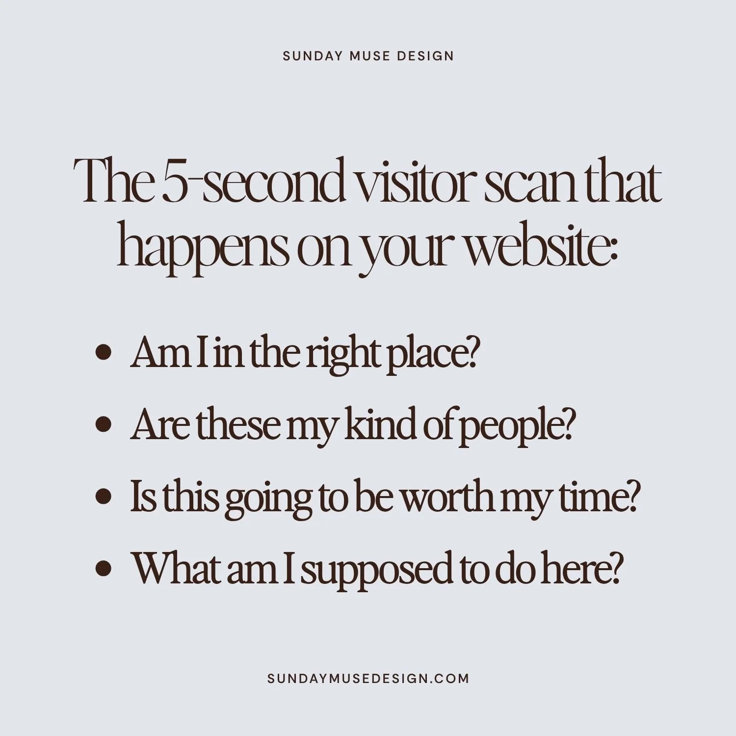
If those four assessments resolve in your favor, they keep going. If even one of them stalls, they're gone, and they couldn't articulate why if you asked them.
The job of every element on your homepage is to make those five seconds resolve in your favor. The hero confirms they're in the right place. The visual identity confirms these are their kind of people. The first scroll communicates it's worth their time. The CTA makes the next step feel obvious.
When all four of those things happen, the visitor moves forward. When one of them doesn't, they don't.
This is why "make the next decision easy for the right person" is the only framework that holds up under pressure. It's the only one that accounts for what's happening in your visitor's body when they're on your site.
Now let me show you where it breaks.
The First Failure Point: The Homepage as a Crowded Hallway

The homepage gets a lot of bad advice. The most common version of that advice is "give it one primary call to action." I disagree with this for most service-based businesses, and here's why.
Think of your homepage as a hotel lobby. Someone walks in, and there are signs pointing to the front desk, the elevators, bell service, the restaurant, the pool, the restroom. The lobby's job isn't to funnel every guest to the same place. The lobby's job is to make sure that wherever the guest is trying to go, they can find their way without asking someone for directions twice.
Your homepage works the same way. It's the orientation point for several different kinds of visitors—the ones ready to inquire, the ones who want to see your work first, the ones who want to read the blog, the ones who want to know more about you, the ones who want to grab the freebie. The job of the homepage is to make every one of those signs legible.
What it shouldn't be doing is offering eight versions of the same sign. There's a difference between "multiple clear pathways to the right destinations" and "every offer, every freebie, every audience segment, every possible journey crammed onto one scroll." The first one is a well-run lobby. The second one is the lobby where the bellhop, the concierge, and a guy with a clipboard all walk up to you at the same time.
The fix isn't fewer doors. It's making sure the doors are pointing somewhere useful. Your services page becomes the Services Lobby, where the visitor walks in and gets oriented to the four offers and figures out which one is for them. Your individual sales pages do the heavy lifting of selling each offer.
Your homepage's job is to gesture toward the right door for the visitor in front of it, with enough signal for them to know which way to go.
The Second Failure Point: Hero Sections That Introduce Instead of Orient
The hero is the most expensive piece of real estate on your site, and most women waste it on themselves. The hero opens with their name, their tagline, their elevator pitch, sometimes a moody headshot. None of that answers the only question your visitor is asking in those first three seconds, which is whether they're in the right place.
A hero that orients tells the visitor who you serve and what shifts when they work with you, in language so specific they recognize themselves on contact. A hero that introduces tells the visitor who you are and hopes they care enough to keep reading. The first one earns the scroll. The second one assumes it.
Your hero is the visitor's confirmation that they landed in the right place. The faster that confirmation happens, the more likely they are to keep going. The slower it happens, the more likely they are to bounce before they ever see the rest of what you built.
The Third Failure Point: About Pages Doing Positioning's Work
The About page is where most women try to do the strategic work that should have been done before the site was ever built. They use the About page to explain what makes them different, what their philosophy is, why their approach is unique, what their values are. By the time someone clicks About, they should already feel all of that from the way the homepage is structured, the language across the site, the visual choices, the offer architecture. The About page should be confirming a feeling they already have.
If your About page is the only place a visitor can figure out what makes you different, your positioning isn't built into your site. It's hiding in one tab. Most visitors never click that tab.
The Fourth Failure Point: Services Pages Built Like Menus Instead of Decisions
Most service pages list offers the way a restaurant lists entrees. Option one. Option two. Option three. Brief description, sometimes a price, button. The visitor is left to figure out which option fits them, and figuring out which option fits them is work, and visitors don't do work.
A services page that converts is built around the question your visitor is already asking, which is which one of these is for me. It walks them through the decision instead of dropping them into the middle of it. That might mean each service has a clear "this is for you if" section. It might mean the page is organized by stage of business or by problem the client is bringing. It might mean a comparison element that frames the differences in plain language.
Your services page is a fitting room. Built right, it lets the visitor try things on and walk out knowing which one fits.
The Fifth Failure Point: CTAs That Don't Match Buyer Readiness
Most women use the same CTA across every entry point on their site. Usually it's some version of "book a call" or "send an inquiry." The problem is that not every visitor is at the same stage of readiness. The visitor on a blog post is in a different headspace than the visitor on a sales page, who is in a different headspace than someone who landed on the contact page through a referral.
The CTA should match where the person is. Cold visitors get clarity-focused CTAs that lower the lift, like "see how it works" or "get the details." Warmer visitors get exploration CTAs, like "explore the service" or "peek inside." Decision-ready visitors get the direct ask, like "send the inquiry" or "book the call." When you serve a buyer the wrong CTA for their stage, you're either rushing them or you're insulting them. Neither one converts.
This is one of the most fixable things on most sites, and almost no one does it right.
The Sixth Failure Point: Social Proof in the Wrong Place
Testimonials are great. Testimonials placed on a page where your visitor isn't yet asking "is this real" are wasted. I see this constantly. The homepage has six testimonials front and center, and the sales page (the place where the visitor is weighing the decision and looking for reassurance) has two short ones at the bottom in italics.
The placement should match the question being asked. The homepage's job is "am I in the right place," so the social proof there can be light and confirming. The services page is asking "is this real, does it work, has someone like me done this," so that's where the testimonials need to land hardest, with names and specifics and outcomes. The contact page is asking "will I regret reaching out," so that's where one strong, recent testimonial does the heaviest lifting on your site.
Putting the right proof in the right place is the difference between testimonials that build credibility and testimonials that take up space.
The Seventh Failure Point: The Homepage Trying to Be Everything to Everyone
This is the master failure, and every other failure point on this list is downstream of it.
The homepage that tries to serve cold visitors, warm visitors, past clients, referrals, freebie-seekers, and decision-ready inquiries simultaneously serves none of them well. It's the equivalent of a host who tries to greet every guest at the door at the same time and ends up greeting no one.
The fix is hard, in the way that all the right answers are hard. Pick the audience that matters most, usually right-fit decision-ready visitors who are closest to becoming clients, and design the homepage as the orientation point for them first. Everyone else can still find what they need. They'll route through other entry points—the blog catches cold visitors, the newsletter opt-in catches the not-yet-readys, the portfolio catches the ones who want to see the work before they trust the strategy. Each entry point does its own job. The homepage does its job, which is making sure your most-likely-to-convert visitor finds the right next door fast.
What Happens When the Site Finally Has One Job
I've now redesigned a lot of websites, and the same thing happens almost every time. The site doesn't dramatically increase traffic, because traffic is a visibility problem and not a website problem. What changes is the quality of the inquiries:
Price-shoppers drop off
Right-fit, ready-to-go inquiries go up
The clients who reach out already understand the offer
They already see themselves in the work
They already trust the process
The sales conversation becomes a confirmation rather than a pitch
That's what your website is supposed to be doing. Looking pretty is the price of admission. The goal is making the next decision so easy for the right person that they can't help but take it.
If your site isn't doing that, the fix has nothing to do with adding more pages or commissioning a fresh design or starting another round of copy edits at midnight while you're rewriting the same headline for the sixth time. The fix is going back to the one job and rebuilding every element around it, with the willingness to remove anything that's in the way.
That's the work. It's strategic in a way that most cosmetic redesigns never get close to, which is why so many sites that look fine still aren't doing what they're supposed to do.