There’s a point in the life of a business when you can look at its website and almost pinpoint when it was made.
Heritage Law had reached it.
The Greenville, South Carolina estate planning firm had grown into a trusted, referral-driven practice with a highly personal approach to helping families make some pretty important decisions. Their reputation had matured, their team had grown, and the experience clients received was thoughtful and high-touch.
Their website was still representing an earlier version of the firm.
When Justin and Meah reached out to Sunday Muse, they weren’t looking to erase Heritage Law’s identity and start over. In fact, keeping the existing logo was important to the team. What they needed was a strategic look at the brand as a whole, followed by a visual refresh and website that could better represent the business they had built.
That distinction shaped the entire project.
Heritage Law already had an identity people recognized, so our job was to build from it thoughtfully and give the brand room to age well.
Starting with the business behind the website
Before opening a design file, we spent time getting to know Heritage Law as a business: what clients valued about the firm, where future growth was headed, what made the experience different, and where the existing brand was getting in the way.
There was already plenty working in their favor.
Heritage Law had built a strong reputation around personalized service and referrals. Their approach was deeply family-focused, and clients received the kind of attention you expect from a smaller boutique firm. Our strategy identified those qualities as some of the strongest parts of the brand and gave us a clear direction for bringing them forward more intentionally.
The website created a different impression.
Its grayscale palette, dated visual treatment, dense pages, and limited hierarchy made the firm feel more impersonal than the experience clients received. Useful information was there, but visitors had to work harder than necessary to find and process it. The team had grown beyond the way the firm was being represented online, too.
The disconnect became fairly straightforward once we could see the whole picture: Heritage Law’s online presence had fallen behind the quality of the business.
From there, we could make design decisions based on where the firm was going while preserving the parts that still belonged.
Keeping the logo was a strategic decision
I think rebrands get a little too trigger-happy with logos.
There are absolutely times when an existing logo is creating a problem and needs to go. There are also times when it has recognition, history, or enough good bones to continue doing its job.
Heritage Law fell into the second category.
The team wanted to keep their existing logo, and our strategy gave us no compelling reason to replace something simply because we were refreshing everything around it. Instead, we developed a new color palette and typography system that could bring the identity forward while keeping Heritage Law recognizable to the people who already knew it.
That decision became an important part of the creative direction.
A brand can evolve significantly while retaining familiar elements. In this case, changing the environment around the logo gave it an entirely different presence and created a visual system with much more flexibility for the firm.

Giving the brand a warmer, more human point of view
Estate planning involves subjects most people would probably prefer not to spend their Tuesday afternoon contemplating.
Clients may be making decisions about their children, finances, healthcare, aging, death, or what happens to the people they love after they’re gone. The legal work requires precision, but the experience also calls for patience, clarity, and a great deal of trust.
Heritage Law already understood that.
Our strategy gave us language and visual direction for expressing it more consistently. The firm's family-first approach, personalized guidance, and boutique service became central to the experience we were building.
That meant creating a brand presence that felt professional and polished while still being approachable. The design needed enough warmth to reflect the people behind the firm and enough restraint to feel appropriate for legal services.
It also meant thinking carefully about how information was presented. Someone researching probate or estate planning should be able to understand what Heritage Law does and find the information relevant to her situation without feeling like she accidentally enrolled in first-year law school.
Clarity became part of the client experience.
Turning a text-heavy website into a guided experience
The original Heritage Law website had plenty to say.
The estate planning page, for example, moved through definitions, long bullet lists, potential scenarios, and explanatory paragraphs with very little visual hierarchy separating one idea from another. The probate page followed a similar structure, while the team page packed education, memberships, credentials, and long biographies into a layout that required quite a bit of reading.
We didn’t need to remove the substance that helped prospective clients understand the firm. We needed to design a better way to consume it.
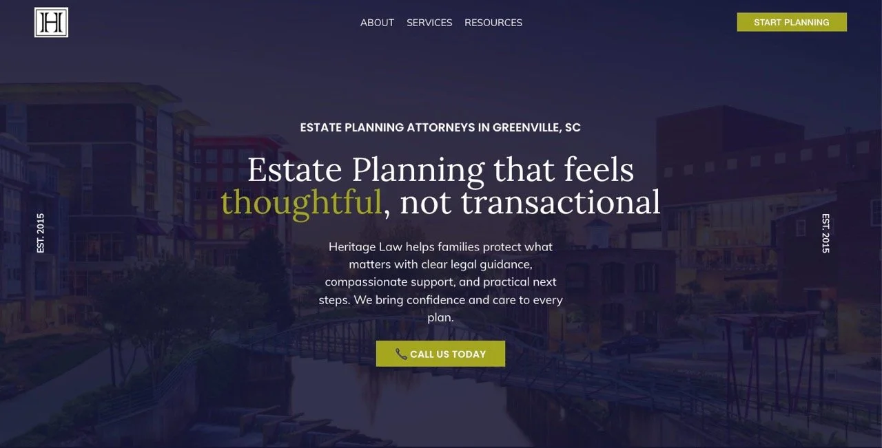
The new website uses hierarchy, spacing, typography, color, imagery, and more intentional page layouts to help visitors make sense of the information as they move through it. Important ideas have room to stand out, related information feels connected, and each page gives visitors a clearer sense of where they should go next.
This is one of those places where website design becomes much bigger than choosing what looks nice.
Websites are decision environments.
People are constantly deciding whether they understand what they’re seeing, whether they trust the business, whether something applies to them, and whether they want to keep going. Good website strategy anticipates those decisions and makes the experience easier to navigate.

Making room for the whole Heritage Law team
The website also needed to represent Heritage Law as the firm it had become.
The previous online presence placed significant emphasis on Justin, even though clients were being supported by a larger team. As we worked through the strategy, building a stronger firm-wide identity became an important consideration for the next chapter of the business.
The redesigned website gives the team a more intentional role in the brand experience and helps prospective clients see the people behind Heritage Law.
For a business built on relationships and trust, that matters.
It also gives Heritage Law a stronger foundation for future growth because the brand can continue expanding with the firm rather than depending too heavily on one person's identity.
Designing for the way people find and choose a law firm
Heritage Law had already built a referral-driven business, which made the website especially important.
A referral may introduce someone to a firm, but there is a good chance that person will still Google the business, visit the website, read about the attorneys, look through services, and form her own impression before reaching out.
The website becomes confirmation.
Someone who arrives after hearing wonderful things about Heritage Law should encounter an online experience that supports those expectations. The warmth, expertise, professionalism, and personal attention people describe offline should be recognizable online too.
Our strategy also considered how visitors would move from learning about the firm into exploring specific services and eventually contacting the team. Clearer calls to action, better-organized information, educational content, and a more intentional site structure all contribute to making that journey easier.
The goal was simple: when the right person arrived, the website should help her understand why Heritage Law had been recommended in the first place.
The finished Heritage Law brand and website
What I love most about the finished project is that Heritage Law still looks like Heritage Law.
There’s continuity between where the firm came from and where it is now. The logo their team wanted to preserve remains part of the identity, surrounded by a visual system that feels much more current. A warmer palette and refined typography give the brand more personality, while the redesigned website creates a clearer, more polished experience for prospective clients.
The result feels appropriate for the business Justine, Meah, and their team have built.
And that, to me, is one of the best outcomes of brand strategy.
Sometimes a business needs a complete reinvention. Other times, the most valuable work comes from recognizing the equity that already exists, understanding why certain pieces have lasted, and giving them a stronger system to live within.
Heritage Law had good bones. We gave them more room to keep growing.
In Meah’s words
“We had an AMAZING experience! Shannon and her staff were very thorough, timely and personable. They streamlined the entire process and helped us build a beautiful site. Highly recommend!”
I’m particularly fond of the word streamlined here 💅
There is a substantial amount happening behind the scenes during a strategic branding and website project, and most of my clients have approximately zero interest in adding “manage my website designer” to their existing job description.
A well-run creative process should reflect the same thinking that goes into the finished work. The Heritage Law team brought their expertise, history, and perspective to the project; we brought the strategy, creative direction, and design expertise needed to turn all of that into a cohesive brand experience.
The process felt manageable to them, and the finished website feels representative of the firm.
That is exactly how I want these projects to work.
When the business has outgrown the website
Heritage Law had already done the hard part. They had years of experience, a strong reputation, happy clients, and a clear way of taking care of the people who hired them.
Their website simply hadn’t kept up.
I see this all the time with businesses that grow through referrals. When people are already finding you and hiring you, updating the website can stay pretty far down the list. It works. People know your name. Business is coming in. There is always something more pressing to do.
Heritage Law reached the point where it made sense to invest in how the firm was showing up online, and we were able to make that investment without discarding the recognition they had already built.
The finished site gives the quality of their business a much better place to show up.
If you’re looking at your own website and realizing it belongs to a version of your business from several years ago, Sunday Snapshot gives us a place to figure out why. We’ll look at the full brand, identify what still serves you, and determine what deserves your attention next.