
The Five-Website Deep Dive I Do Before Designing Yours

I have five websites open on my computer.
By the third one, I’ve already noticed they’re all using the same font.
By the fourth, I realize three of them have almost the same homepage.
By the fifth, I have seen the word “elevated” enough times for one lifetime.
This is one of the first things I do when I start working on a website.
I look around.
Because the people coming to your website have been looking around, too.
They’ve seen your competitors. They’ve clicked around on Instagram. They’ve asked a friend who they hired. They probably have a few tabs open right now.
And whether they know it or not, all of that looking has taught them what a business like yours tends to look like.
I want to see what they’ve been seeing.
Why I look before I design
Every type of business starts to develop a certain look.
Wedding photographers do it. Interior designers do it. Lawyers do it. Coaches REALLY do it.
Spend 20 minutes looking at five businesses in the same field and you’ll start to notice.
The same colors keep popping up. The websites are laid out in similar ways. People use the same words to describe their work. Their services are explained the same way. Sometimes even the photos start to feel familiar.
There’s usually a reason for some of it.
If I’m looking for a wedding photographer, I expect to see a lot of wedding photos. (Please do not make me hunt for those in the spirit of originality.)
Other things keep showing up because they keep showing up.
I want to know the difference.
That gives me a much better place to start when I sit down to design your website.
I start with five websites
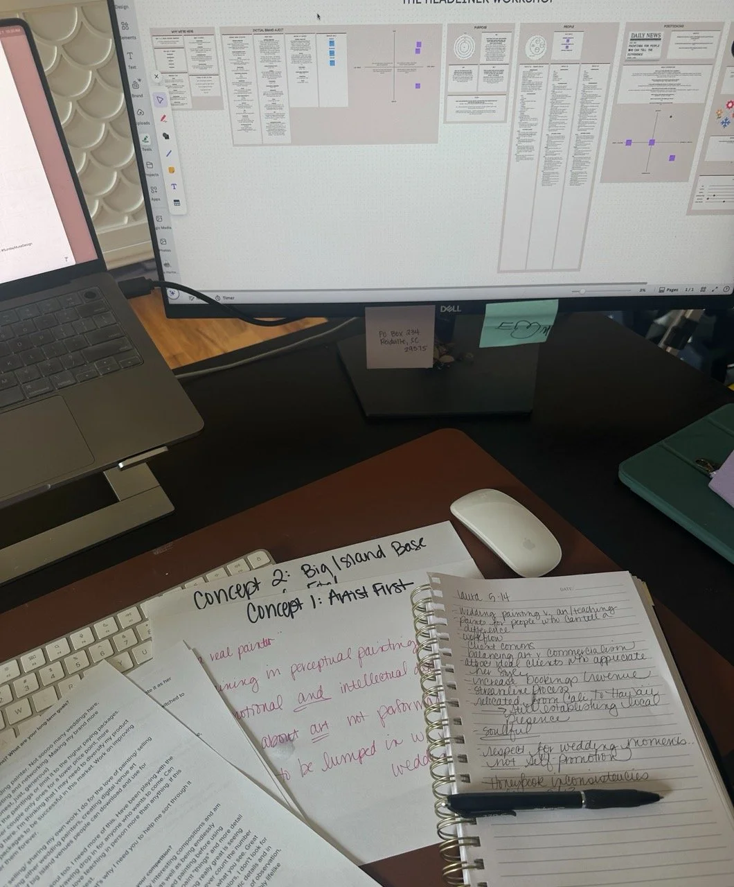
Five is my sweet spot.
It’s enough to spot patterns. It also keeps me from looking up three hours later with 31 tabs open and a deep knowledge of a stranger’s business model.
I’m looking at businesses that make sense for your project. They might be your direct competitors. They might serve the same kind of client. Sometimes I’ll include a business that is a little further ahead because I want to see what changes at that level.
Then I poke around.
I look at what I notice first.
I look at the colors, fonts, photos, layouts, and little design details that keep showing up.
I read the headlines. I see how they talk about what they do. If everyone says they offer a “luxury experience,” I’m making a note of that. If I could copy a sentence from one website and paste it onto the other four without anyone noticing, I’m definitely making a note of that.
I look at how they sell.
Do they show prices? How do they explain their services? What do they tell you before asking you to inquire? Do I understand what happens after I click the button?
Then I look for proof.
Maybe that’s a killer portfolio. It could be years of experience, client reviews, press, awards, big-name clients, results, or a really clear process.
I’m paying attention to where that proof shows up, too.
A glowing testimonial hiding three scrolls down the page is doing a very different job from one sitting right beside the claim it backs up.
And somewhere along the way, I usually start to see where everyone blends together.
I’ve written a whole other rabbit hole about why brands in the same industry start looking alike, because once you see it, you really can’t unsee it.
That’s when things get good.
I want to know what feels normal
People like knowing where they are.
When you walk into a coffee shop, you don’t need a sign explaining that you order at the counter. You’ve done this before. Your brain recognizes the setup and gets on with it.
Websites work the same way.
Your client has learned what certain things mean because she has seen them over and over.
That can be helpful.
If every florist shows a portfolio, there’s probably a good reason. If every lawyer explains what happens after you reach out, people may need that information before they feel ready to call.
So I pay attention to what feels normal in your field.
Those familiar pieces can make your website easy to use and help people understand your business faster.
Then we get to decide where your personality should come through.
I also want to know where everyone starts looking the same
This happens all the time.
I’ll have five tabs open and forget which business I’m looking at.
Same colors. Similar photos. Same three words. Same style of headline. Same basic homepage.
They may all be great at what they do.
I just can’t remember who said what.
Your future client may be doing the same thing.
She clicks through a few websites. She likes all of them well enough. Then she closes the tabs and tries to remember which one had the thing she liked.
This is why I care so much about making a brand recognizable.
“Different” isn’t the goal. Recognizable is.
You can put a neon green button in the middle of your homepage and I will absolutely remember it.
That doesn’t make it a good idea.
I want people to remember something about your business because it makes sense for your business. The interesting part usually comes from looking closely at what is already there. Your work might have a point of view that isn’t coming through online yet, or you may have built a client experience that deserves far more attention than it’s getting. Sometimes there’s already a detail people associate with you, and the smartest thing I can do is make it easier to notice and remember.
That’s the good stuff.
So when her friend asks, “Wait, which designer were you talking about?” she knows exactly which one.
Then I close the tabs
Once I’ve seen enough, I close everything and bring my attention back to your business.
By then, I have a pretty good feel for what your client has been seeing as she looks around. I’ve noticed what keeps popping up, where businesses start to blur together, and which things seem to help people understand what they’re buying. All of that stays in the back of my mind while I’m thinking about your goals, your work, your clients, and where the business is going next.
Sometimes the research changes an idea I had going into the project. I love when that happens. It means I found something worth knowing.
Sometimes it shows me why everyone keeps making a certain choice, and I decide it makes sense for us, too.
And sometimes it gives me the very specific thought:
Ohhhh. There it is.
There’s the thing everyone else is missing.
There’s the part of your business I want people to remember.
There’s where we can have some fun.
And THAT’S why I do the five-website deep dive before I design yours.
This is part of the strategy work I do before design starts, because what we learn before I open the design file gives me a much better filter once I do.

I could make you a beautiful website without doing any of this research. I couldn’t make the smartest website I’m capable of making.
The five-site deep dive gives me a read on the room before I decide how your business should show up in it. Then every choice I make has more behind it than “this looks good.”
That’s what I mean when I say good design has a reason.
If your brand and website have reached the point where they no longer feel like the business you run, Sunday’s Best is the full Sunday Muse treatment. We work through the strategy, brand identity, website, and SEO together so the whole thing feels like one business again. See it in action.
And yes, I’ll have my five tabs open before I touch the design.