Whitney knew exactly what she didn’t like about the Host & Co. brand.
Unfortunately, it was pretty much all of it.
She had spent more than five years in the event industry and built a business largely through referrals. Clients trusted her to manage the details, coordinate vendors, keep timelines moving, and stay steady when an event inevitably decided to…event.
Online, Host & Co. was much harder to distinguish.
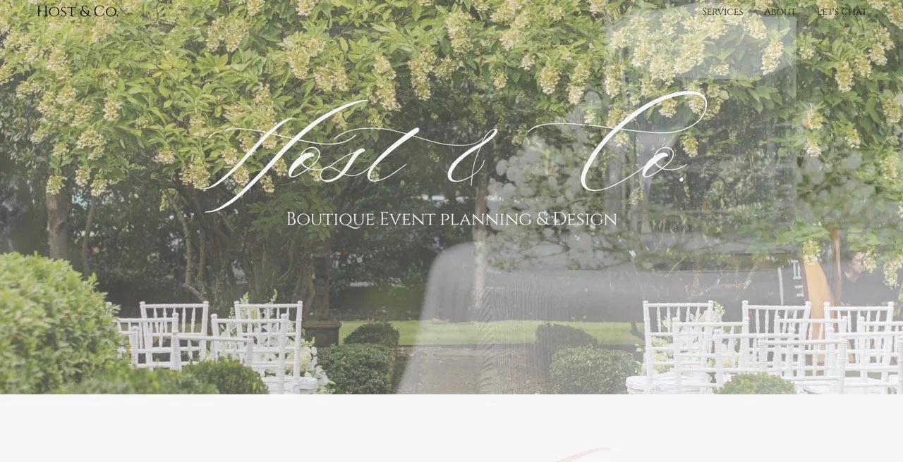
The soft blush palette, delicate script, romantic imagery, and broad language placed the brand squarely inside a familiar wedding-planner aesthetic. Whitney could see the problem herself. Prospective clients were comparing Host & Co. with other planners, and she worried there wasn’t enough in the brand to give them a reason to remember hers.
As she put it:
“Host & Co. was an event planning company that didn't have a strong brand awareness or direction. I knew what I didn't like, and frankly it was my own branding & voice. I felt that it was costing me clients that could directly compare my brand to others. It was clear I didn't stand out.”
That gave us a very specific problem to solve with her full rebrand and website.
Host & Co. needed to become more recognizable while making Whitney’s expertise much easier to see.
The business they had built
Host & Co. had grown into a full-service event planning company serving weddings, corporate and nonprofit events, and social celebrations.
Whitney’s clients tend to have high standards and plenty of opinions about how they want their event to feel. Many already have a strong vision. What they need from her is the person who can take everything floating around in their heads, organize it, manage the moving pieces, and make sure the event runs the way they imagined it would.
During our strategy work, Whitney talked about couples who wanted to enjoy their engagement instead of spending it managing vendors. She described hosts who cared deeply about their guests’ experience and wanted to be present enough to enjoy it themselves.
The more we dug into the client experience, the more obvious Whitney’s role became.
She is good at being in charge.
There is a lot of unglamorous work tucked inside a beautiful event. Someone is checking contracts, following up with vendors, tracking the budget, thinking through logistics, building the timeline, answering questions, and making sure ten other people know where they’re supposed to be.
Whitney likes that part.
And her clients repeatedly appreciate it. The feedback surrounding Host & Co. points to her organization, preparation, responsiveness, and ability to stay calm under pressure.
Those qualities gave us much better material for a brand than another promise to make your wedding unforgettable.
Where the existing brand was falling behind
The old Host & Co. brand was attractive in a familiar way.
Blush, beige, cream, delicate script, and romantic event photography created a soft visual identity that immediately made sense for weddings. The problem showed up when we looked at Host & Co. alongside the rest of the market.
It blended right in.
Our competitive research found many of the same visual conventions across boutique event planners: muted neutrals, airy serif typography, script accents, light-filled photography, and language built around words like bespoke, elevated, luxury, and memorable.
Whitney’s website also gave aesthetics more attention than the operational side of her work.
Someone browsing the site could see that she planned beautiful events. It took more effort to understand why you would trust her to manage one.
There was another issue brewing underneath that.
Host & Co. had room to grow well beyond weddings. Whitney wanted more corporate work, stronger online visibility, and eventually a team and business structure that gave her more freedom.
The brand needed enough range to go there with her.

What we needed the new brand to communicate
We kept coming back to the feeling Host & Co. creates for its clients.
You can care deeply about the details of an event and still hand responsibility for them to someone else.
In fact, that is exactly what many of Whitney’s clients want.
They want to know someone competent has the timeline. They want vendors to have a point person. They want to walk into the room and experience what they spent months planning instead of mentally running through what still needs to happen.
That put Whitney’s leadership at the center of the brand strategy.
Host & Co. needed to feel composed, prepared, stylish, and clearly in charge. The experience could have personality because Whitney has personality. The visual identity could have taste because the work demands it. Underneath all of that needed to be a sense that someone very capable had the clipboard.
The idea we built the brand around became:
Style, under control.
Three words that gave us an enormous amount to work with.
The strategic decisions that shaped the direction
Once we knew what Host & Co. needed to be known for, the creative decisions got much more specific.
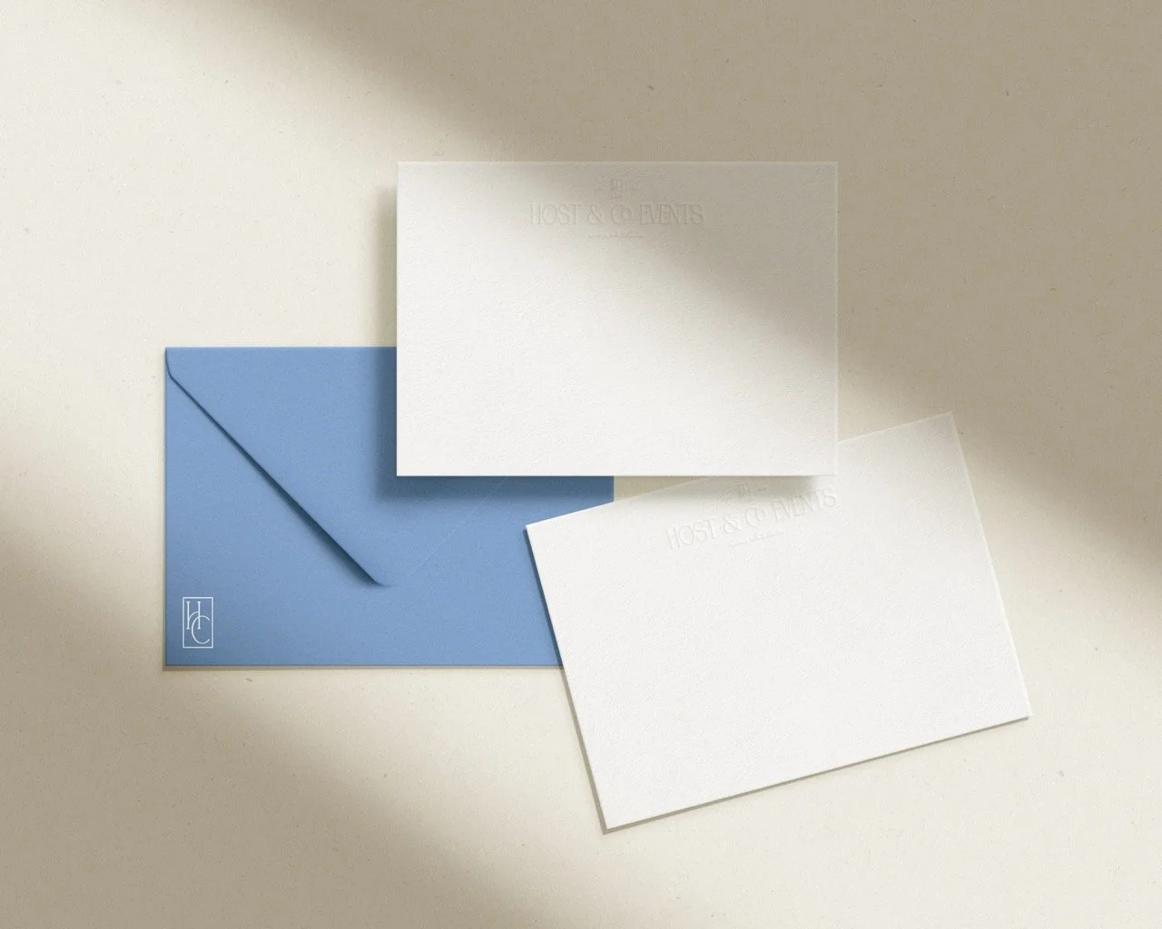
We moved toward a stronger editorial influence and a visual system with more structure. The new palette introduced blue and green, colors that gave Host & Co. a more distinctive presence within its category and enough versatility to work across weddings, corporate events, and social celebrations.
We also wanted the brand to feel rooted in its market. Host & Co. is based in Greenville and serves events throughout the Carolinas, so that sense of place became part of the identity rather than a keyword we awkwardly stuffed into every other paragraph.
The voice developed around the same strategic idea.
Whitney could speak with more authority about the work because she had earned it. We had real experience, a clear process, strong client feedback, and a very specific understanding of what people were hiring her to handle.
That gave the messaging some backbone.
“Style, under control” became a useful filter across the project. If something felt decorative for decoration’s sake, it probably wasn’t helping. If it made the brand feel more deliberate, recognizable, and assured, we were getting somewhere.
The identity
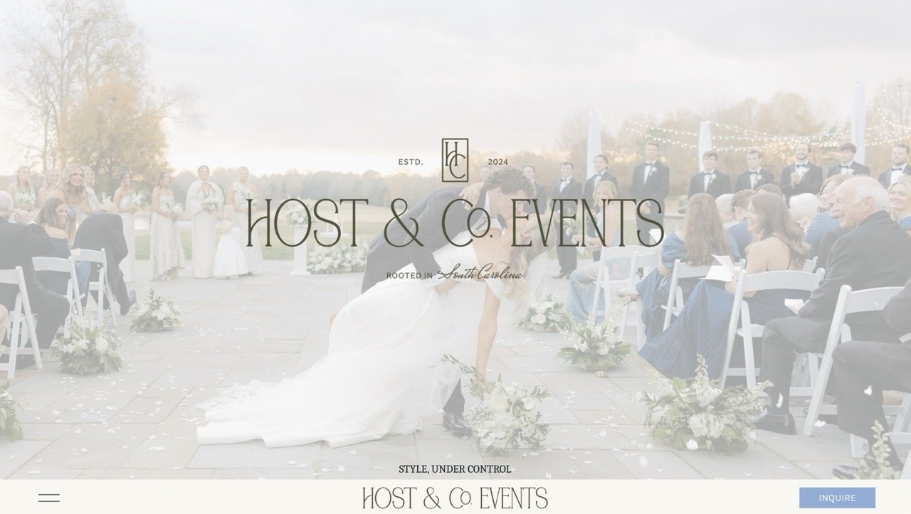
The new Host & Co. identity has a custom logo suite designed to work across a much larger brand system.
The primary logo uses tall, editorial typography with an HC monogram incorporated into the lockup. We created secondary configurations for different applications, along with a standalone monogram that gives Whitney a recognizable brand mark when the full name would be too much.
Then we gave the identity another visual device I especially love: the pinstripe-inspired pattern.
It brings structure into the brand in a way that feels subtle and useful. Across the blue, green, and neutral palette, it can show up in backgrounds, printed pieces, social graphics, packaging, or any of the dozens of places an events company eventually needs its identity to behave itself.
The typography has enough character to feel editorial and stylish while remaining legible and flexible across the brand.
Together, those pieces give Host & Co. a visual language that can extend well beyond a logo at the top of a website.
Good design has a reason.
Here, every part of the identity comes back to the same perception we wanted to build: style with a very capable person behind it.
The website
With the identity established, the website had a much clearer job.
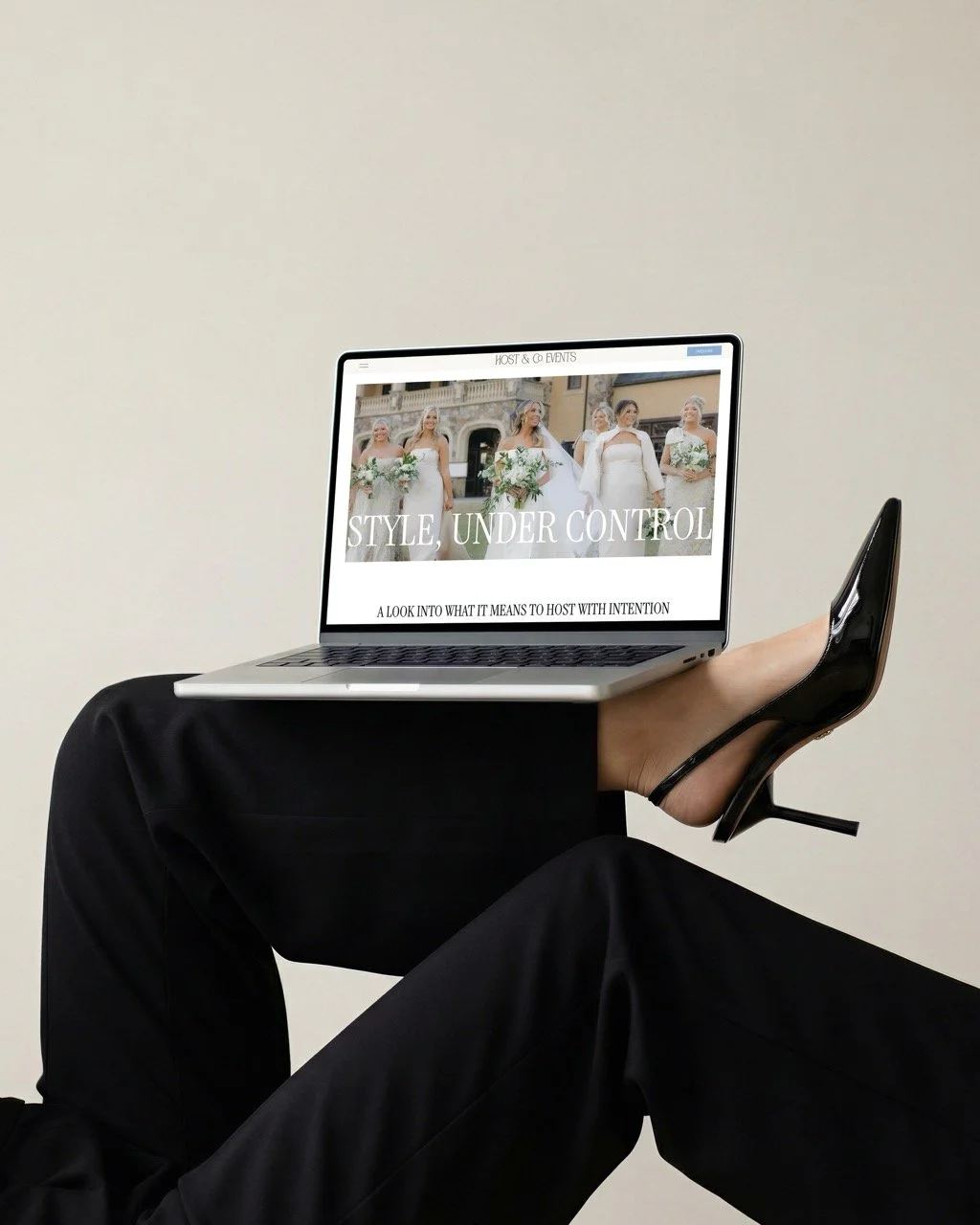
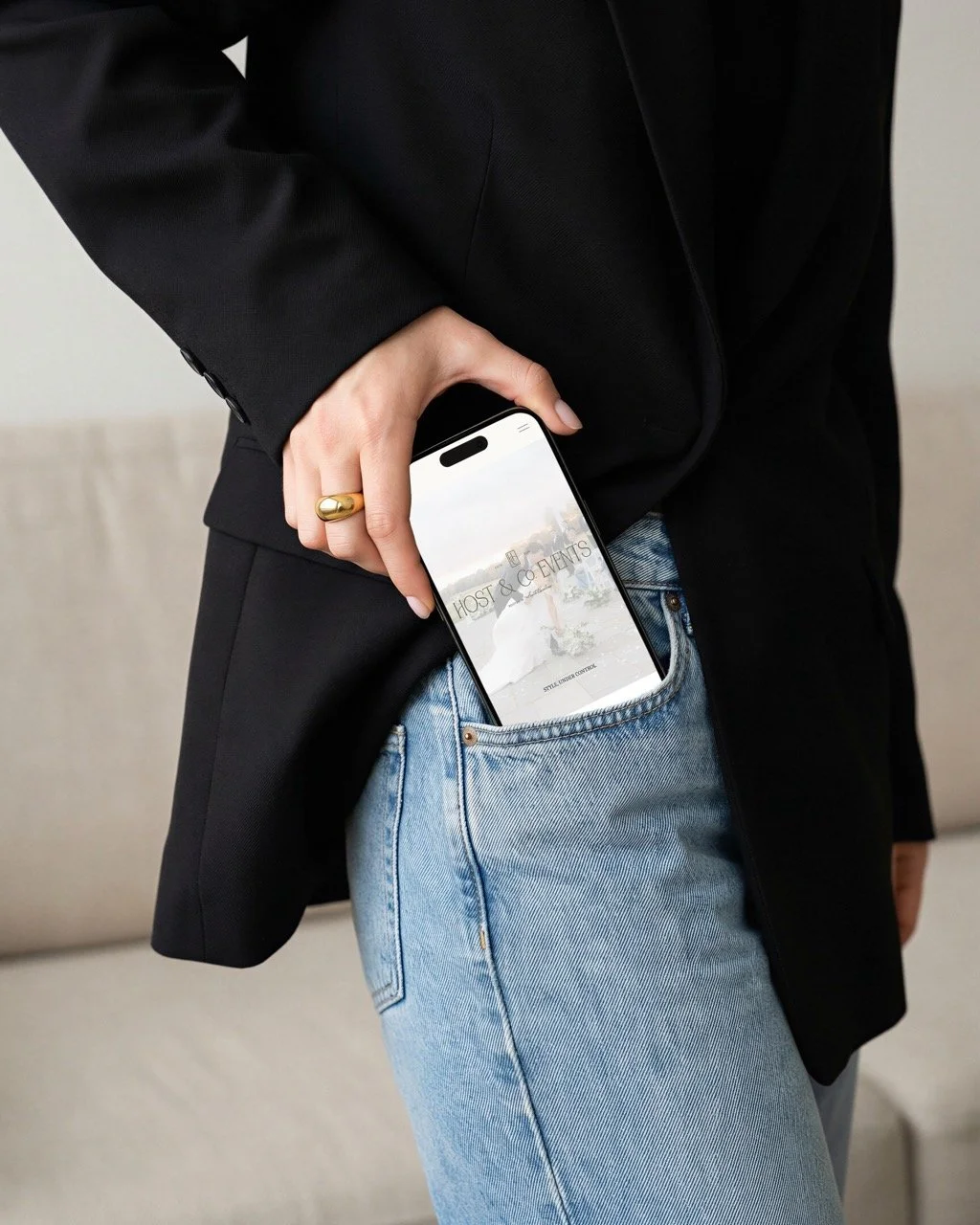
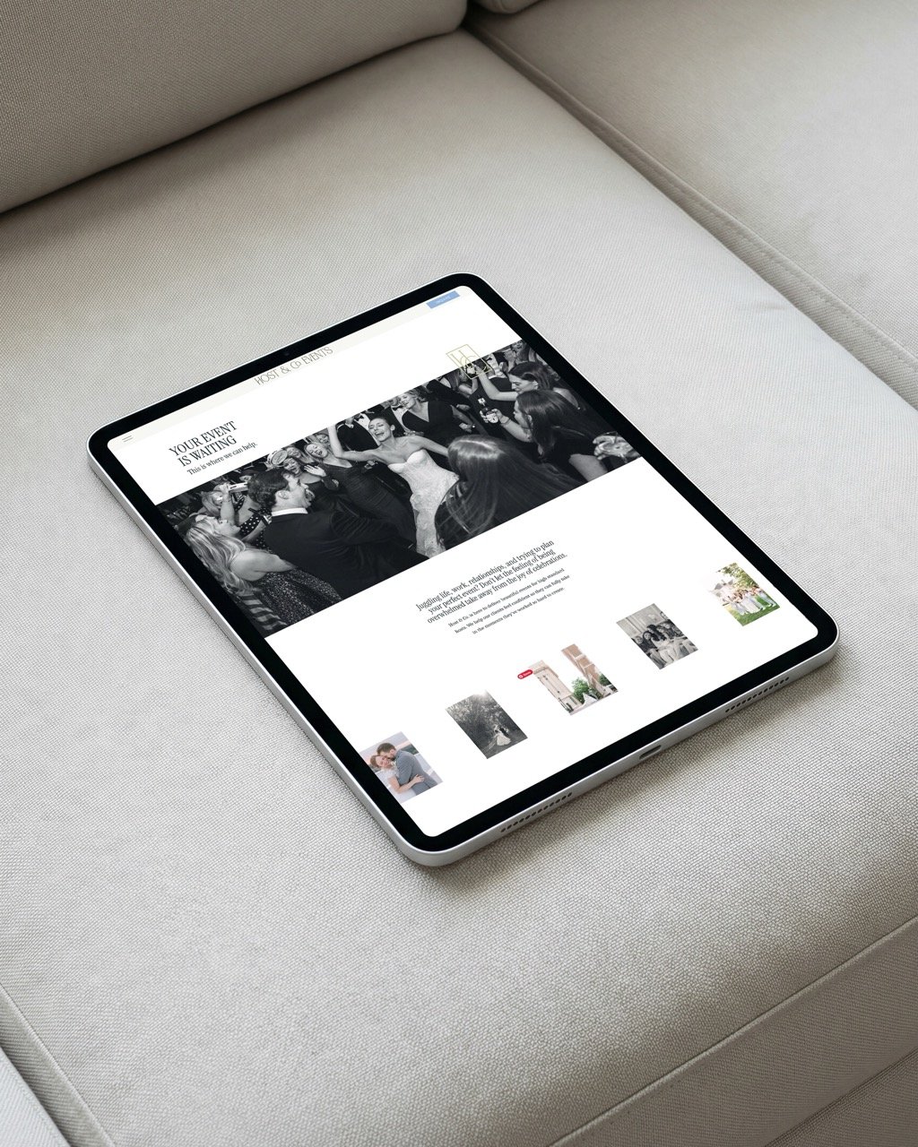
The new homepage opens with “Style, Under Control” and quickly introduces what that means for the client: thoughtful event planning and design backed by experience, organization, and someone who knows how to take the lead.
We created clear paths into weddings, corporate and nonprofit events, and social celebrations so visitors can get to the information that matters to them without sorting through services built for someone else.
Whitney’s role also becomes much clearer throughout the site.
She is there to guide the planning process, manage the logistics, coordinate the people involved, and keep the event moving. That expertise gives prospective clients something concrete to evaluate when they are deciding who they trust with an event carrying a considerable amount of money, time, and expectation.
The portfolio plays a larger role, too.
Host & Co. has years of beautiful event photography, and the new layouts finally give those images room to work. The site can show Whitney’s eye for design while the surrounding messaging explains the planning expertise responsible for getting everything there in the first place.
The details that made it recognizably theirs
Recognition rarely comes from one dramatic design decision.
For Host & Co., it comes from the way the whole system behaves.
The tall letterforms in the logo create a distinctive silhouette. The HC monogram gives the brand a compact signature. The pinstripe pattern introduces a structured graphic element that can travel across touchpoints. The palette creates continuity even when the event photography changes dramatically from one project to another.
Then there is the language.
“Style, under control” gives Whitney a phrase she can use well beyond the website because it reflects something true about how she works.
That has already started happening.
After launch, Whitney told me she was using her new brand voice in client communication and sales calls. That matters to me because a useful brand should make it easier to communicate the business consistently when the designer is no longer sitting beside you.
The identity belongs on the website.
The strategy belongs in the business.
Where the brand is now
Launch day gave Whitney one of the first glimpses of how differently people were seeing Host & Co.
“When my brand and website went live across socials, it was an overwhelming feeling of ‘ahh I love this’. So many people (that I don't usually chat with) reached out just to compliment and rave about the brand. Close friends & family knew how I felt about my old branding so getting to hear it from unsolicited sources was really a great feeling.”
There is no conversion statistic hiding behind that quote, and I’m not going to invent one.
What we do have is a meaningful shift in Whitney’s relationship with the business she built.
She told me she loves sending people to her website now. She finds herself looking at it and feeling proud of where Host & Co. is. She feels more polished and confident, and she is excited about where the company is headed.
Her description of the process might be my favorite part:
“The process was in depth and so intentional. Every conversation made me pull answers about my brand that I haven't even thought of. The lead up conversations were so detailed but very important and seeing the final product, I know the importance of those conversations now.”
That’s what we do around here.
A full brand and website project gives us a lot of pretty things to photograph at the end. The decisions underneath them are what make those things useful.
Whitney came in knowing something felt off. Through strategy, we figured out what people already valued about Host & Co., where the business wanted to go, and what the brand needed to communicate to help it get there.
Now, when she sends someone her website, she is proud of what they are about to see.
I’ll take that.
If your business has outgrown the brand representing it
There comes a point when tinkering has run its course.
You know the business is good. Your clients know it. Referrals may be keeping things moving just fine.
And you’re still hesitating before you send someone to your website.
Sunday’s Best is my strategy, brand identity, and website experience for businesses ready to work on the whole picture at once.
We’ll get clear on where the business is going, build an identity with enough substance to become recognizable, and create a website that makes the quality of your work easier to see.
If your business has outgrown the brand representing it, Sunday’s Best is where we fix that.