

How One Conversation Changed an Interior Design Brand (The Roan Project)
Kelly called me from a tourism conference with a laptop that was, in her own words, “garbage.'“ It was a 2016 model creeping up on ten years of life expectancy, and it had picked the kickoff call for her brand and website to fully give up with no camera and a connection that dropped her out of the conversation three separate times. So we did the call anyway. She talked, I recorded, and somewhere in the middle of troubleshooting her headphones she said the sentence that ended up reshaping the entire project.
We'll get there.
But first, some context, because the most interesting thing about Roan has nothing to do with the logo or the color palette (though I'll happily talk your ear off about both). Kelly is a repeat client, and the brand she walked away with is not the brand she came in to build.
Why Sunday Strategy™ Comes Before Any Design Work
Kelly and I had worked together before (on SEO for her wedding company) so by the time she came back for Sunday Strategy™, we already had history. She’d already seen how I think and how the work goes, so the conversation started about three steps in. She was open to going somewhere she couldn't have predicted on day one, because she'd watched me get a few things right already.
So…Sunday Strategy™ came first, as its own engagement, before a single design decision got made. I do it in that order for a reason... When a client is later looking at a typeface they didn't expect and wondering why it's right, the strategy is where the answer lives. Skip it and you're choosing fonts on vibes, and vibes don't hold up the first time you start second-guessing them.
When Kelly came in, the plan was one business holding two offerings: weddings and home design, side by side. That's what we started strategizing against. And then the strategy did what good strategy does—it kept asking questions until the business told us the truth.
The Pivot: Weddings Stay, Home Design Becomes the Brand
By the kickoff call for the brand and web build, Kelly had made a decision that changed everything. Weddings would stay—as their own thing, under Roan Weddings & Events. The new Roan brand would focus on home design, flips, remodels, and full-service styling.
Here's what I find interesting about that, having watched it happen more than once…
The strategy gave Kelly room to admit something she'd been circling for years, and the new branding and webite gave her something solid enough to stand on that she could commit to without second-guessing.
Here's how she'd describe the through-line of her own career: crafting an experience, telling a story, making dreams a reality.
She'd been doing exactly that as a live TV sports producer, then across eleven years of weddings, then in real estate. Pulling the home design/styling out from under the wedding umbrella let each one stand on its own terms, instead of asking one brand to speak for two businesses that had grown in different directions.
So we built two doors. The new Roan site mentions wedding styling and design, then sends those inquiries to the wedding company. As Kelly put it on our copy call: "We are one, but we are separate." That single line became the architecture for how the two businesses relate on the site.
Why "Range" Became the Strongest Thing About the Brand
When we started, Kelly worried that her range was a liability. It's a worry I hear all the time from multi-passionate people with interesting careers. Somewhere along the way she'd absorbed the idea that you're supposed to be great at one thing, and that TV production plus weddings plus real estate plus home design read as scattered instead of impressive.
I see it the other way.
Producing live television, running a wedding day, revealing a finished home—none of them give you a second chance or take. You get one shot and it has to go right in front of everyone watching. What looks like four unrelated jobs is one rare skill in four different rooms: the ability to orchestrate a high-stakes moment so it comes off effortless.
So the strategy turned the supposed weakness into the proposition. Roan is a collection of disciplines that work together, and the variety is the reason Kelly can do what she does. You can follow it through her story on the About page, from the control room to the wedding aisle to the living room, and it reads as one person who has spent her whole career making complicated things look calm.
Andrea Shah, the copywriter we brought on for this project, caught the spirit of it in a line on the About page I love: if Roan isn't five steps ahead, they're five steps behind. The years in production and weddings are what make that foresight believable.
The Bar Metaphor: Building an Offer Ladder That Turns No One Away
When we started, Roan had exactly one offering in mind: a high-end, full-service experience for clients who wanted every detail handled. It’s high-end work at an appropriate price, behind a single narrow door. The trouble with a narrow door is that plenty of the right people walk up to it, see the cover charge, and turn around—people who would happily spend money with Kelly at a level she wasn't offering yet.
So I brought Kelly a metaphor I picked up years ago and have never forgotten. Don't turn anyone away from the bar. If someone can't sit down at the five-star table for the full tasting menu, that's fine—they can still pull up a stool and order a drink and a bowl of peanuts. You keep them in the room. You build the relationship. And when they're ready for the table, they already know they like the place.
That idea became Roan's offer ladder. At the top is the Home Curation Experience, an ongoing relationship where Roan sources every piece and finish and stays on call to style the mantel for the holidays or track down a vase that looks like the one from your grandmother's living room. In the middle is Full-Service Styling & Design. At the entry point is the Styling Blueprint, a done-with-you package built around a consultation and a hand-picked shopping list, for the client who wants a designer's eye but plans to do the implementing herself.
That bottom tier is the peanuts at the bar, and it's a paid entry point. Kelly and I agreed it should cost something, because a small barrier filters out the people who were never going to commit and protects the time of whoever's doing the work. Someone can self-implement now and move up to full service later, when the season of life and the budget shift. The same person can grow from the stool to the table without ever leaving the room.
The Western North Carolina Story That Couldn't Be Borrowed
Roan comes from Roan Mountain, in Kelly's corner of Western North Carolina—the gathering place, where her family hikes the wildflower meadows and spreads out blankets for a picnic. We named the brand to honor the land and the legacy, on a simple premise: the spaces around us shape our stories, and our stories shape the spaces where we choose to live.
This part of the strategy got more weight than I expected going in, because of timing. Kelly's region was hit hard by Hurricane Helene in 2024. On our copy call she was raw about it—the area had become the star of the show, she said, for all the wrong reasons. She didn't want to build a brand on the tragedy, and she didn't want to act like it never happened. What she wanted to point at was the rebuilding: a downtown coming back, businesses reopening, and her own conviction that the time to build the legacy she wants is now, while the rest of the area is doing the same.
We let that sit as an undertone rather than a headline. The brand is about taking a piece of Western North Carolina and telling that story through physical space—hospitality at the heart, gathering, a home that becomes the thing you pass down. You cannot buy that positioning off a shelf. It only works because it's hers.
Designing a Brand That Scales Into a Bigger Vision
I had to keep one fact in mind the entire time I was designing: Kelly is dreaming much bigger than a home-design studio.
She has her eye on a large piece of property she’d like to restore into a small-town gathering place someday—room for vendors, food, retail, and other businesses to set up shop, the kind of spot that gives a community somewhere to go. Think Magnolia’s Waco silos, scaled to her mountains. Whether that specific dream comes together or takes another shape entirely, the ambition behind it is the genuine engine of the business, and it isn’t going anywhere.
If I'd designed a brand that only knew how to talk about throw pillows and paint decks, it would have boxed her in within eighteen months. So Roan got built with headroom—a system flexible enough to stretch from a single-room refresh to a multi-building destination without needing a teardown.
That's what building to scale means in practice: a foundation roomy enough that the brand still works when the business grows into something larger, instead of needing a redesign the moment it does.
The Final Brand: Refined, Magnetic, Sharp
Now the part you've been scrolling for.
Roan's three core values came out of the strategy and held through every decision that followed: masterful orchestration (the precision and foresight from the TV-and-wedding years), refined perspective (thoughtful design with personal storytelling underneath it), and hospitality at the heart (the conviction that a space should feel as good as it looks).
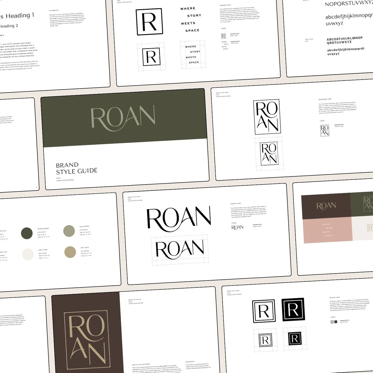
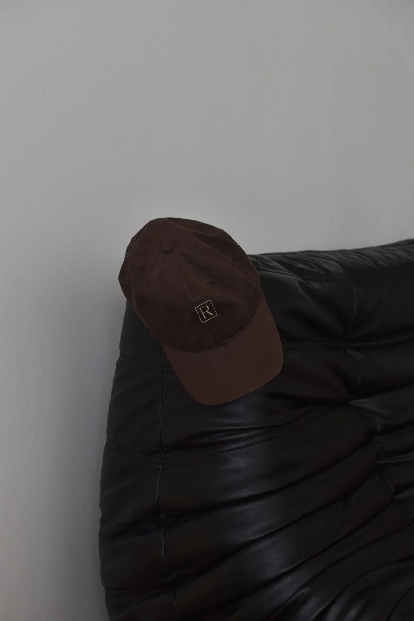
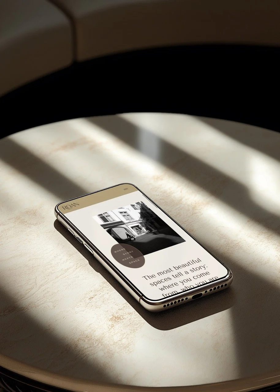
The visual identity reads as refined, magnetic, and sharp, with three creative themes guiding the design: architectural softness, narrative details, and everyday editorial. The logo is a clean sans-serif wordmark with a sweeping ligature curving under the O and A—structured, a little dramatic, equally at home in a small mountain town and a glossy magazine spread.
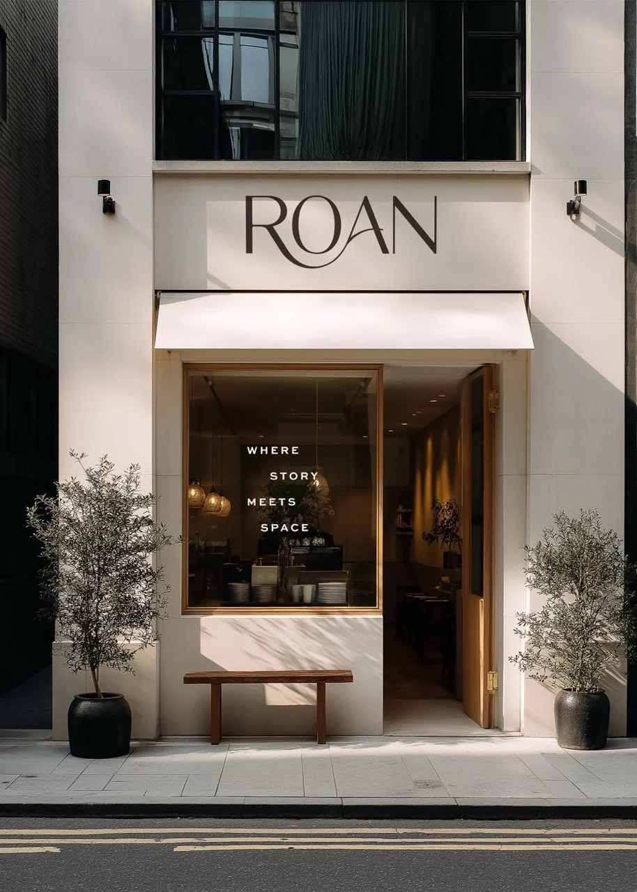
The palette resolved a tension Kelly was clear about from the start. She likes black but didn't want a black background. She's drawn to pink but doesn't think of herself as a pink person. So we built around Ivory Linen as the dominant, with Cypress Green as the grounding primary and Espresso Silk standing in as her version of black—a deep, warm brown that does black's job without the heaviness—plus Soft Gold, Brushed Clay, and Olive Smoke in support. It's classic and warm with enough depth to feel intentional, and it gave her the richness she was after without the literal black box she didn't want.
Typography is built on clean sans-serif faces with no script anywhere—Tenor Sans for headlines, Work Sans for body, a sharper sans for accents. The whole system points at her aesthetic north stars: Magnolia's simplicity, Studio McGee's modernity, and Addison's Wonderland's color and approachability.
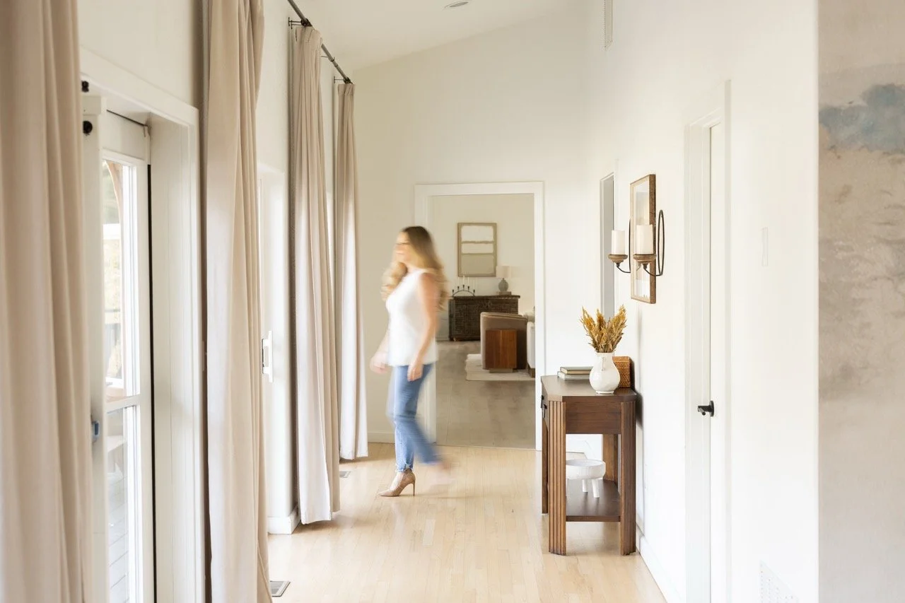
Building the Website on Showit
The site is built on Showit, across thirteen pages—home, about, the home and interiors services page, a portfolio with individual galleries, contact, an opt-in, the standard utility pages. The top navigation stays deliberately spare: About, Services (Home & Interiors), Portfolio, Contact, with the logo doubling as the link home.
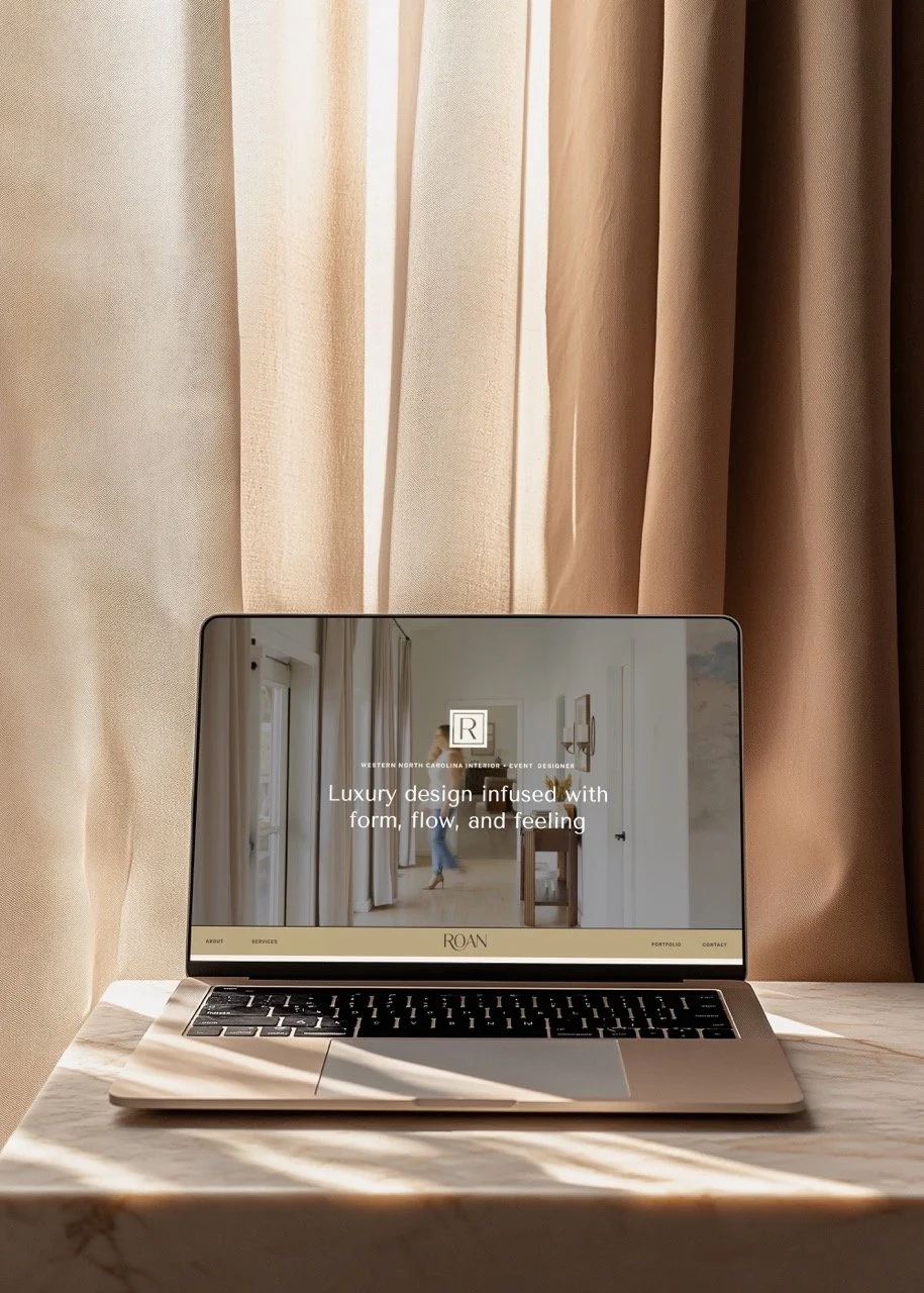
The primary action we want a visitor to take is a direct inquiry email. The secondary is a newsletter signup. Everything else on the page exists to earn one of those two clicks. Kelly came in with her own reference points—Addison's Wonderland for the way text and image stack at different levels, Anthropologie for video-and-photo combinations instead of autoplay headers, The Row for clean modern restraint (though she felt The Row tipped into too much empty space). The three feelings she wanted a visitor to walk away with: calm, engaged, and a sense that this is unlike everything else without being so modern it turns cold.
The copy is where Kelly's voice comes through hardest, because Andrea pulled it straight from the source. The grandmother's house, the Princess Diana bells and teacups that taught Kelly what elegance meant, the refusal to design an all-white living room for someone with a two-year-old who eats PB&J on the move—none of it is invented. It came out of the conversation almost word for word, and it's what makes the brand feel like a specific person instead of a mood board.
What This Project Says About How I Work
This was a layered engagement—Sunday Strategy first, then creative direction, brand identity, copy, and the full website design and build. Kelly continued with the full brand and web build because the strategy work had already shown her what was possible, and each phase went deeper because we'd built up that much more trust by the time we got there.
I'll tell you what I'm proudest of, and it has nothing to do with the palette. The strategy surfaced the business Kelly actually wanted, instead of the one she'd walked in describing. Anyone can execute a brief. The harder, more valuable work is hearing what a client hasn't figured out how to ask for yet, giving her the language and the structure to commit to it, and designing a brand that still fits when the business grows into something bigger. Roan is a home-design brand with a fifteen-acre dream built into its foundation. My job was to make the brand big enough to fit the whole story she's telling.
If you've built something good and you're starting to suspect your brand is telling a smaller story than your business deserves, that's exactly the kind of project I love. It usually starts with Sunday Strategy™.